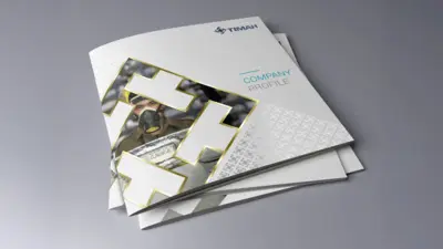
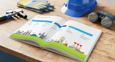
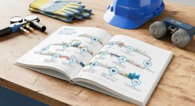
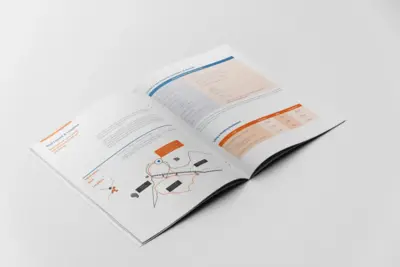
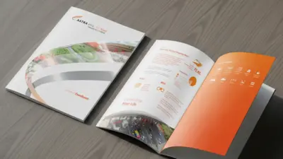
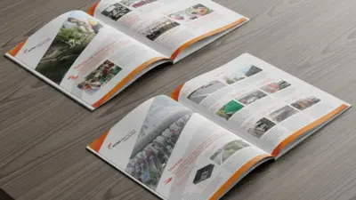
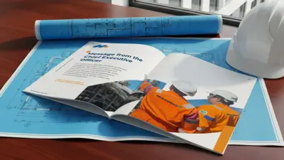
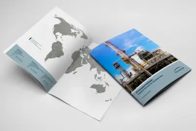
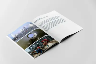
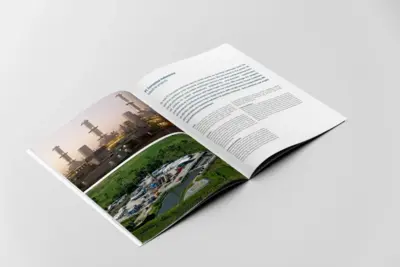
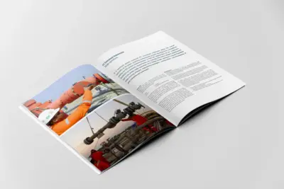
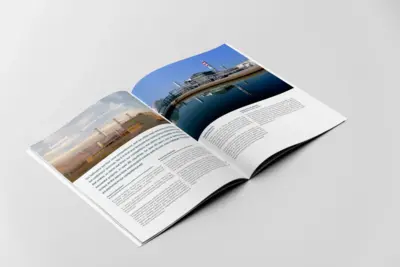
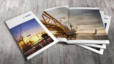
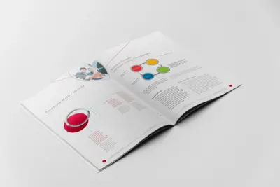
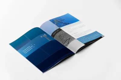
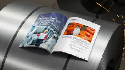
Timah Persero Tbk.
We undertook the complete design, layout, and production of Timah's corporate profile. The design concept centers on a powerful cover that uses an abstraction of the Timah logo as a dynamic frame, revealing a glimpse into their operational world. The project's premium quality is defined by its sophisticated finishing techniques. We utilized hot foil stamping, gold for the Indonesian version and silver for the English, to create a distinct and elegant highlight. Furthermore, a custom pattern derived from the logo was applied with a subtle spot UV, adding a layer of tactile branding that can be felt and seen. The result is a corporate communication tool that reflects the company's prestige through exceptional design and artisanal print quality.
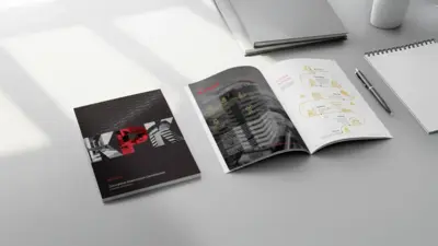
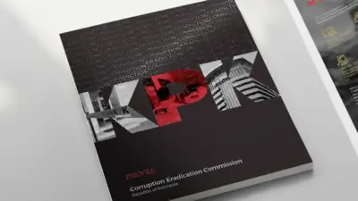
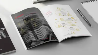
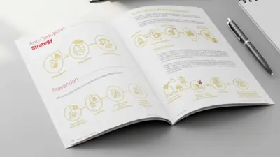
Komisi Pemberantasan Korupsi (KPK)
We were tasked with the complete copywriting, design, layout, and print production of the official profile for Indonesia's Corruption Eradication Commission (KPK). The project's goal was to create a corporate communication tool that clearly articulates the commission's crucial functions and strategies in a professional and accessible manner. The cover design features a powerful and modern aesthetic, with the "KPK" acronym serving as a window to images representing their work. To add a layer of sophistication, the cover utilizes a blind spot UV technique, creating a subtle pattern from repeating text about anti-corruption principles. Internally, the layout employs clean infographics and clear typography to explain complex topics such as the commission's duties, functions, and anti-corruption strategies. This comprehensive design approach resulted in a profile that not only informs but also projects the integrity and authority of the institution.
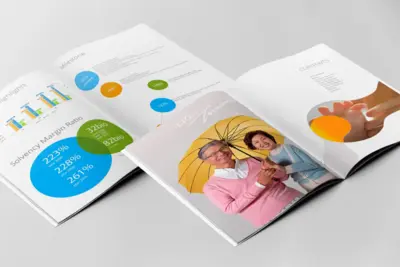
Paljaya
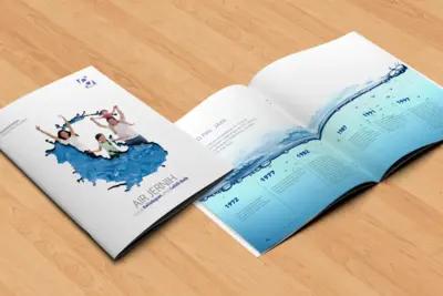
We handled the complete design and layout for the Perumda Paljaya company profile, centered on the theme "Air Jernih Untuk Kehidupan yang Lebih Baik" (Clean Water for a Better Life). The design concept visually represents the fluidity and importance of clean water. A key feature of the design is the cover, which utilizes a custom diecut in the shape of a water splash. This creative element frames a heartwarming image of a family, immediately connecting the company's technical services to the human benefit of a healthier life. The layout throughout the profile maintains a clean, bright, and modern aesthetic, effectively communicating Paljaya's mission to provide essential sanitation services for the community.
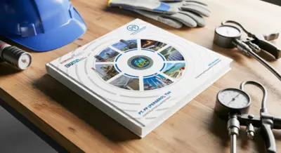
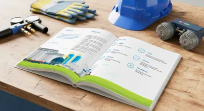
PP EPC
We were tasked with the comprehensive design, layout, and print production of the company profile for the EPC (Engineering, Procurement, Construction) Division of PT PP (Persero), Tbk. The design concept was built to clearly articulate the division's extensive capabilities and business lines. The cover features a dynamic circular frame showcasing the company's diverse project portfolio, with a subtle spot UV finish applied to the frame segments for a premium, tactile effect. Internally, the profile utilizes a clean and professional layout with custom infographics to detail key corporate information, including their Vision & Mission, AKHLAK values, 7 Key Business Lines from upstream to downstream, company milestones, and organizational structure. This approach resulted in a comprehensive and sophisticated communication tool that effectively conveys the scale and expertise of PP EPC.
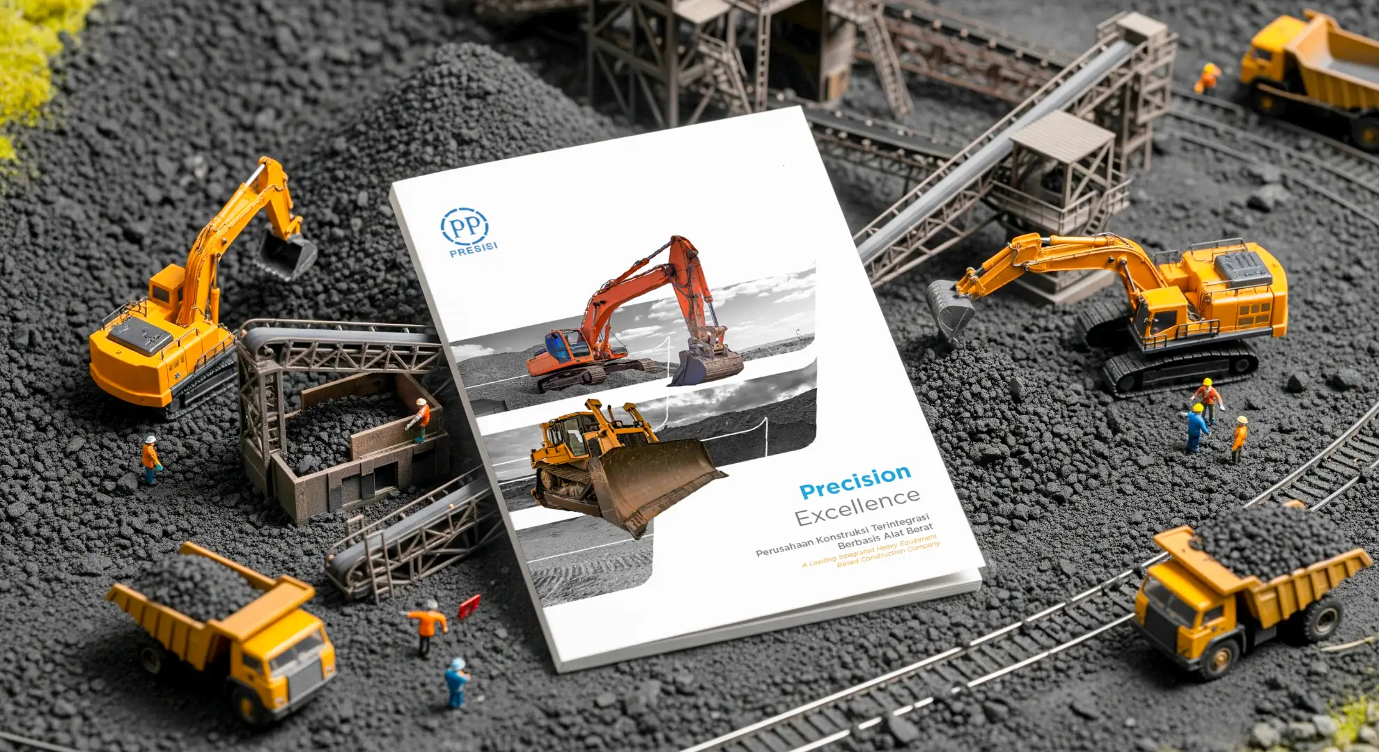
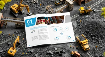
PP Presisi
As a leading integrated construction company, PT PP Presisi Tbk required a corporate profile that fully embodied their core theme of 'Precision Excellence'. Our strategic approach was to build a design framework founded on clarity and professionalism. The resulting profile utilizes a clean, modern layout with custom infographics to articulate the company's story, from their 'Company Milestones' and 'Valued Propositions' to their detailed 'Sure Return Process', in a sophisticated and highly accessible format.
LAPAN
The challenge for LAPAN's company profile was to translate their high-tech and scientific identity into an engaging and accessible print document. Our design solution centered on creating a unique "supergraphic", an abstract visual element inspired by the wings of the LAPAN logo. This fluid, aerodynamic graphic becomes a consistent visual thread throughout the profile, creating a sense of motion and innovation. Tasked with the complete design, layout, and print production, we developed a clean and professional aesthetic that complements the supergraphic. The result is a corporate profile that not only informs but also visually embodies the organization's core theme: "Akurasi dalam Setiap Solusi" (Accuracy in Every Solution).
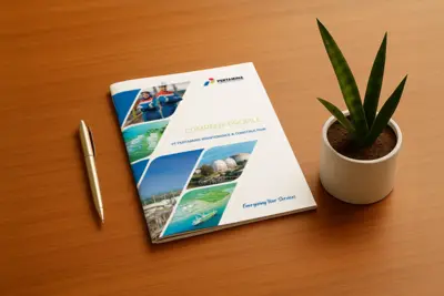
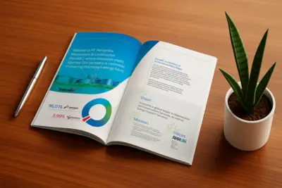
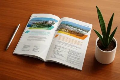
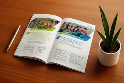
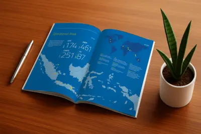
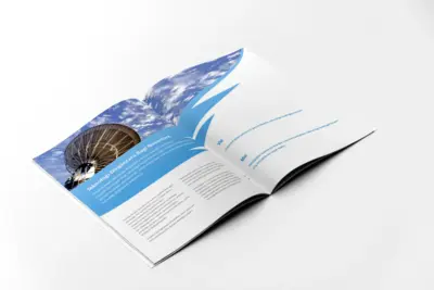
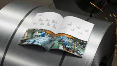
Pertamina Maintenance & Construction (Perta MC)
The core challenge for PT Pertamina Maintenance & Construction's company profile was to articulate the breadth of their specialized services under the powerful theme, "Energizing Your Services". Our design solution centered on a dynamic, fluid layout where clean graphic elements and professional photography intersect, creating a sense of energy and continuous motion. This visual language was applied throughout the profile to detail the company's comprehensive service pillars. The profile clearly presents their extensive operational area across the archipelago, highlight projects, and a roadmap for digital system implementation, creating a corporate document that is both highly informative and visually compelling.
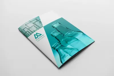
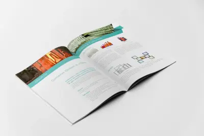
Mulia Glass
The objective for Mulia Glass's company profile was to clearly present the value and capabilities of their Container Division. The design solution centered on a clean, modern, and professional aesthetic that utilizes high-quality photography and a dynamic, angular layout to create a sense of clarity and precision.
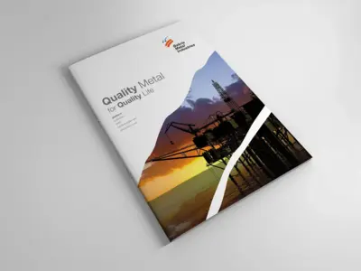
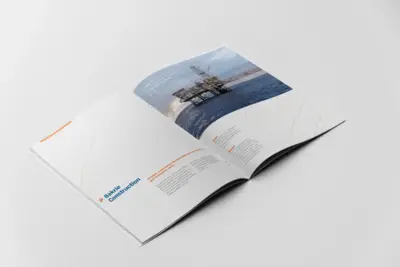
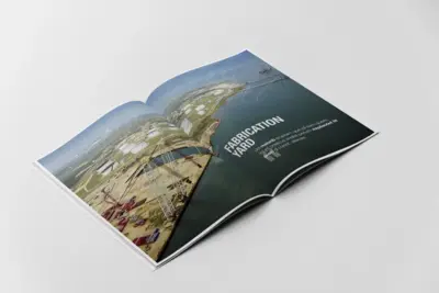
Bakrie Metal Industries
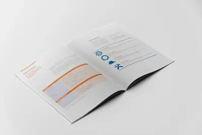
We helped Bakrie Metal Industries to create a corporate document that clearly communicates their extensive capabilities in the heavy industry sector. The design is built on a clean, professional, and structured layout, utilizing a strong grid system and modern typography to present complex information in a clear and accessible manner. The profile effectively showcases the company's core services using distinct iconography and organized content blocks. The overall design projects an image of precision, strength, and reliability, perfectly aligning with Bakrie Metal Industries' brand and their "Quality Metal for Quality Life" tagline.
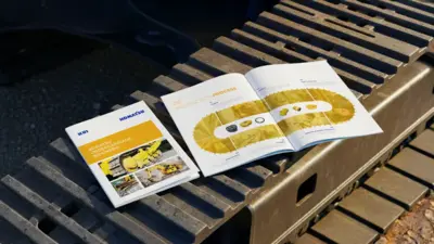
Komatsu Undercarriage Indonesia
Inspiration for this company profile was drawn directly from the client's core product. The centerpiece of the design is a bespoke infographic that visually maps the entire production process onto the distinct, caterpillar-track shape of a heavy equipment undercarriage. This central concept informs the entire document's aesthetic. A clean, technical layout, paired with professional photography, articulates the company's story with clarity and precision. Our comprehensive role spanned the full project lifecycle, from initial design concept and layout to photography and managing the final print production, ensuring a high-quality result that embodies Komatsu's standards.
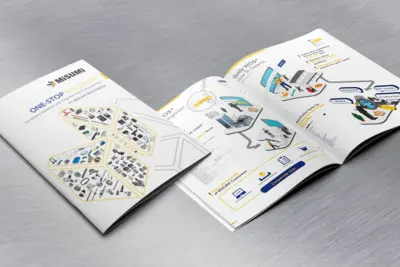
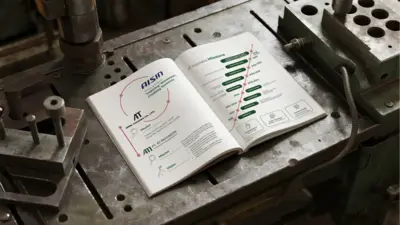
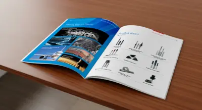
Misumi Indonesia
For Misumi's diverse engineering audience, navigating a comprehensive e-catalogue can be a complex task. This company profile was conceived as a highly practical user guide, transforming the traditional corporate document into a clear roadmap for their "One-Stop Solution" platform. The design employs clean lines and a structured infographic style to visually walk users through the entire journey, from account registration to advanced product searches by keyword, part number, or brand. By prioritizing clarity and a user-centric flow, the profile not only showcases Misumi's capabilities but also actively empowers customers to use their system with ease and efficiency.
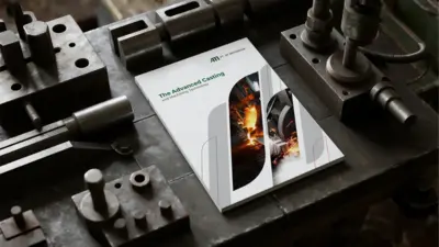
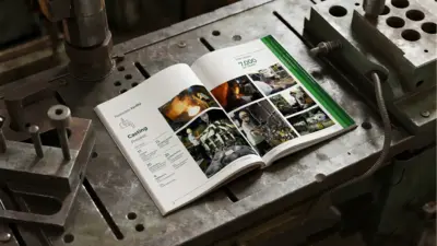
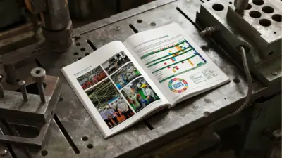
Aisin Takaoka Indonesia (ATI)
The core challenge for the AT Indonesia company profile was to capture the power and precision of their work in "The Advanced Casting and Machining Technology". Our creative direction translated this industrial strength into a clean and dynamic print document, utilizing a design motif of layered, curved frames that reveal powerful photographic imagery from their production facilities. Our comprehensive role covered the entire project lifecycle, from art directing the photography and crafting the corporate narrative to managing the final layout and print production. The profile clearly articulates the company's story, showcasing their mission, milestones, production facilities, and commitment to Sustainable Development Goals (SDGs). The result is a professional and compelling corporate tool that embodies the quality and forward-thinking vision of AT Indonesia.
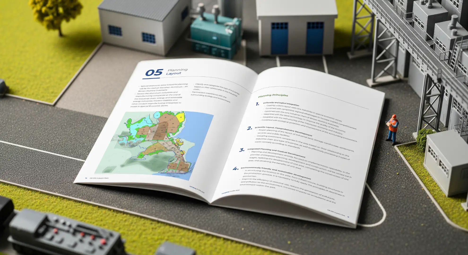
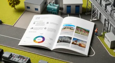
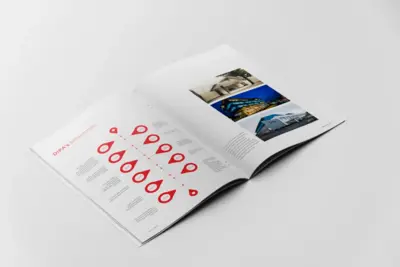
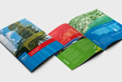
GBKEK Industrial Park (Galang Batang Kawasan Ekonomi Khusus)
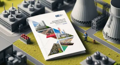
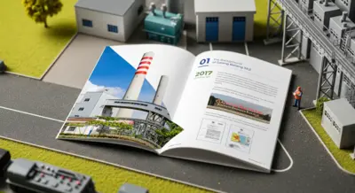
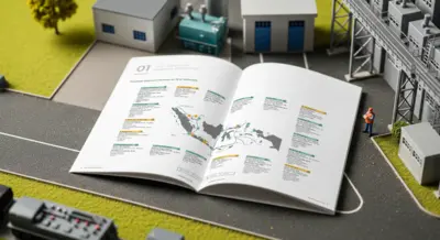
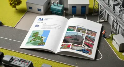
The challenge for this company profile was to articulate the comprehensive vision behind the "Management and Development Plan of Galang Batang Special Economic Zone". Our design approach focused on creating a clean, professional, and highly structured document that conveys the scale and strategic importance of this major industrial project. A key feature is the dynamic cover design, which uses an angular, arrow-like motif to frame various photographic highlights of the industrial park's infrastructure. This approach resulted in a corporate document that is not only informative but also visually represents the forward momentum and structured planning of the Galang Batang SEZ.
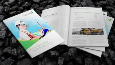
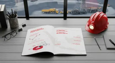
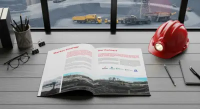
Adaro Energy
The central theme for Adaro Energy's corporate profile, "Delivering Energy to Build the Nation", required a design that was both powerful and professional. Our approach was to create a clean, modern layout that uses dynamic angles and high-quality photography to tell the story of their extensive operations. The profile's visual language balances large-scale industrial imagery with a bright and forward-looking aesthetic. We developed a structured layout to clearly present key corporate information, such as financial parameters and operational details, in a format that is both accessible and reflective of the company's significant stature in the energy sector.
Turangga Resources
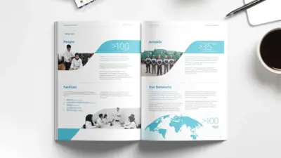
As a vital subsidiary within the Pama Persada Nusantara and United Tractors Tbk ecosystem, Turangga Resources required a company profile that articulates both its diverse capabilities and its connection to a powerful industrial legacy. The cover design immediately establishes this, featuring four distinct quadrants whose colors represent the company's core business pillars. A subtle, debossed pattern, derived from the 'Turangga' (Javanese for horse) motif in their logo, adds a layer of tactile sophistication, symbolizing the power and reliability inherent in their operations and heritage. Inside, the profile utilizes a clean layout to articulate the company's full scope, from coal mining and trading to its strategic role within the broader PAMA and United Tractors group. Our comprehensive role covered the entire project lifecycle, ensuring the final document was a powerful reflection of the company's stature.
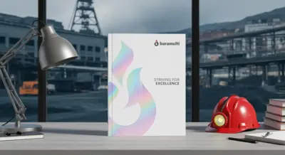
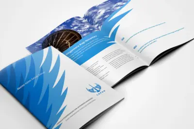
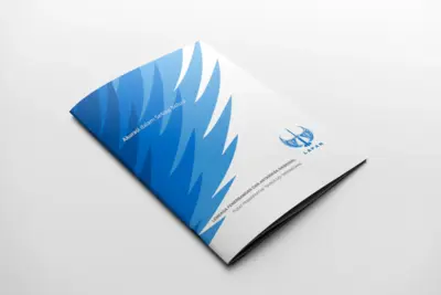
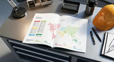
Baramulti Group
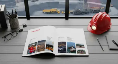
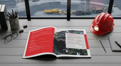
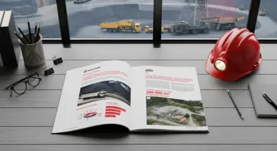
The central challenge for Baramulti Group's corporate profile was to communicate the scale of their operations and their forward-looking market strategy. The design solution is built around the theme "Striving for Excellence", which is immediately established on the cover by an elegant, flame-like "supergraphic" element. To give this a premium and modern feel, this graphic was produced with a striking holographic hot foil finish, creating a memorable first impression. Inside, the profile utilizes a clean, professional layout with strong typography and data visualizations to articulate the company's story. The document details their "Company At a Glance", "Global Reach, Local Expertise" through clear infographics on production and export destinations, and profiles of the various companies within the Baramulti Group. This comprehensive design approach resulted in a corporate document that not only informs but also visually represents Baramulti's commitment to quality, excellence, and their position as a leading energy company.
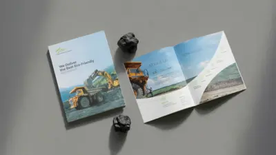
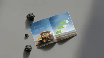
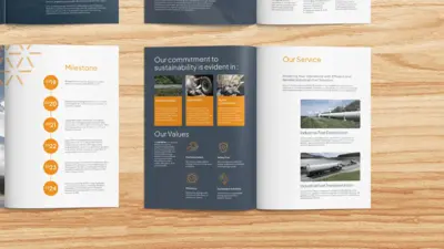
Arjuna Batubara Indonesia
The central theme for Arjuna Batubara Indonesia's company profile, "We Deliver the Best Eco-Friendly Environment", required a design that was clean, modern, and trustworthy. Our approach centered on a professional layout that uses high-quality photography and a clear visual hierarchy to articulate the company's commitment to responsible mining. The profile effectively communicates the company's story and capabilities. The design clearly outlines their "About Us" section, "Core Values" such as Safety and Discipline, a visual timeline of their "Milestones", and showcases their diverse "Fleets" and "Corporate Social Responsibility" initiatives. This comprehensive approach resulted in a corporate profile that not only details their services but also powerfully conveys their dedication to balancing mining operations with environmental stewardship.
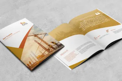
Cahaya Kota Nusantara
The core objective for the Cahaya Kota Nusantara company profile was to visually represent their identity as the "Best Trusted Construction Company". Our approach was to create a design that feels strong, professional, and trustworthy, utilizing a clean layout with dynamic, angular graphic elements and high-quality photography of their construction projects. The profile's design is defined by its clear structure, and its prominent feature is the use of a powerful quote that encapsulates their philosophy. This human-centric approach to the design resulted in a corporate profile that effectively communicates CKN's commitment to quality, integrity, and building for people.
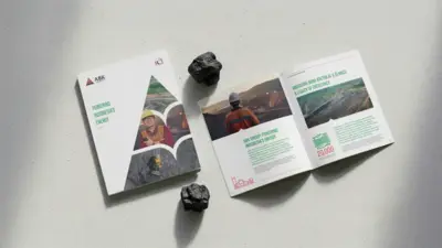
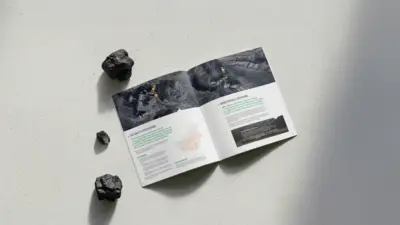
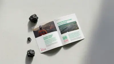
ABK Group (Anugerah Bara Kaltim)
The core objective for the ABK Group company profile was to create a powerful and comprehensive document that visually represents their identity under the theme "Powering Indonesia's Energy". Our design approach utilized a clean, modern layout with a distinctive leaf-like graphic motif to frame high-quality photography from their mining operations. This corporate profile clearly articulates the company's story, from its founding to its present status as a dynamic and forward-thinking energy group. The layout effectively showcases the group's "Legacy of Excellence" their commitment to quality and specifications, operational methods, and the comprehensive scope of work of their subsidiaries like RCI.
Solid Group
This corporate profile for Solid Group Indonesia was designed to embody strength and prestige. The cover makes an immediate premium statement, featuring their logo rendered in striking gold hot foil and set against a tactile blind spot UV pattern derived from the brand's core symbol. Internally, a clean and structured layout uses dynamic photography and clear data visualization to articulate their operational scale, including key bauxite and coal production statistics. The result is a communication tool that visually and physically reflects the company's leading stature in the mining industry.
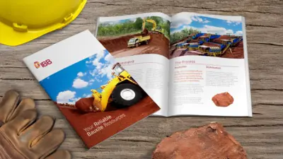
Indonesia Batubauksit Bajarau
Our engagement with Indonesia Batubauksit Bajarau (IBB) was a comprehensive branding project, beginning with the foundational development of their new logo and corporate visual identity. The challenge was to create an identity that conveyed strength and reliability in the bauxite resource industry. This new brand identity was then translated into a powerful company profile, for which we handled the design, layout, and print production. Centered on the tagline 'Your Reliable Bauxite Resources', the profile uses dynamic, high-quality photography and a clean, modern layout to articulate the full scope of IBB's operations, from their commitment and production processes to their distribution capabilities.
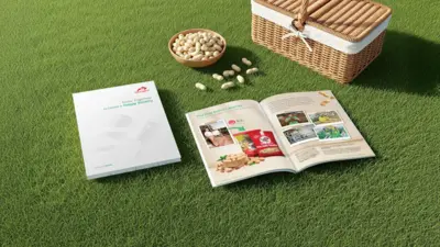
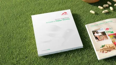
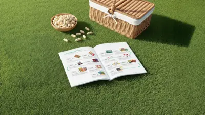
Dua Kelinci
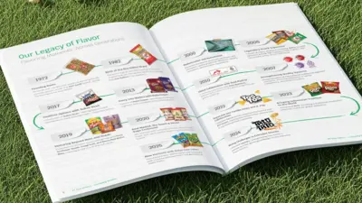
The challenge for the Dua Kelinci company profile was to narrate their long and flavorful history, from humble beginnings to a global snack powerhouse, in a clean, modern, and engaging format. The document's cover introduces the core theme, "Grow Together to Create a Happy Society," and features a subtle, abstract pattern derived from the Dua Kelinci logo, applied with a blind spot UV finish for a premium, tactile feel. Our comprehensive role spanned the entire project, from content writing and photography direction to final design, layout, and print production. A central feature of the profile is "Our Legacy of Flavor," a visual timeline that beautifully illustrates the company's journey and key milestones, from their founding in 1972 to their global collaborations and product innovations. This approach resulted in a corporate profile that not only tells a compelling brand story but also visually embodies the quality and heritage of the Dua Kelinci brand.
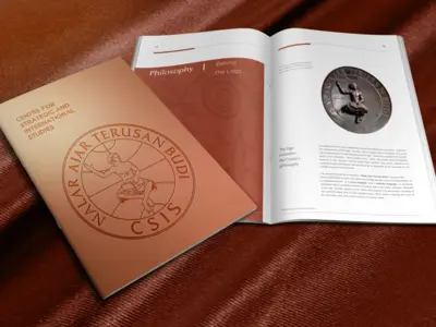
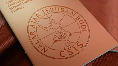
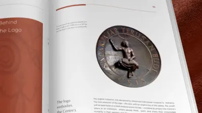
CSIS
For the renowned think tank CSIS, the challenge was to create a corporate profile that reflects their profound intellectual legacy and institutional prestige. Our design solution focused on creating a document with a classic, authoritative, and sophisticated aesthetic, handling the complete design, layout, and photography. The profile's cover makes an immediate statement of distinction. It was produced using a specialized bronze metalized carton, giving it a unique weight and sheen. The iconic CSIS logo, with its "Nalar Ajar Terusan Budi" inscription, was then applied using a deep deboss technique, creating a tactile and memorable impression that physically represents the organization's depth and history.
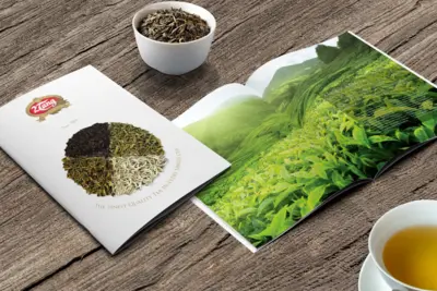
Dua Tang
The challenge for the 2Tang company profile was to visually narrate a story of heritage that has been "Brewed Since 1942". Our design solution centered on a clean, elegant, and natural aesthetic that allows the quality of the tea itself to be the hero. The cover immediately communicates this focus, featuring a beautiful circular arrangement of various tea leaf types, representing the brand's diverse offerings under the theme "The Finest Quality Tea in Every Single Cup". Inside, the profile uses lush, full-page photography of tea plantations contrasted with clean, modern layouts to articulate the brand's story. Our comprehensive role spanned the entire project, from art directing the photography and crafting the layout to managing the final print production, ensuring the document felt as premium and authentic as the tea itself.
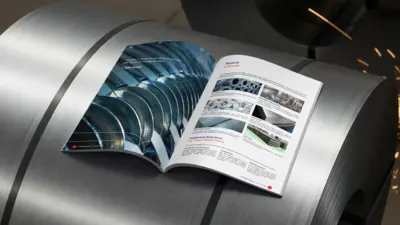
Astra Infra Toll Road
The core objective for the Astra Infra Toll Road company profile was to create a corporate document that visually embodies their theme of "Connecting Your Life". Our design solution utilizes Astra Infra's distinctive supergraphic, a set of flowing, curved lines, as a primary visual element to frame high-quality photography throughout the document. The cover immediately establishes this concept, where the supergraphic, enhanced with a premium spot UV finish, serves as a dynamic window into the world of their infrastructure. Internally, the clean and modern layout clearly articulates key corporate information, showcasing their vision and mission, commitment to social responsibility, and technological innovations. This cohesive design approach resulted in a profile that not only details their extensive operations but also powerfully communicates their role as a vital connector in people's daily lives.

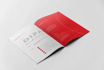
Dipa Healthcare
Our engagement with Dipa Healthcare was a comprehensive branding project that began with the foundational development of their new logo and corporate visual identity. The challenge was to create an identity that visually communicates their core mission: "To Improve The Quality of Life."
This new brand identity was then translated into a sophisticated company profile, for which we handled the complete design, layout, and print production. The profile utilizes a clean, modern aesthetic with fluid, wave-like graphic elements and professional photography to articulate the company's full story. It showcases their corporate milestones, business overview, extensive product lines, from pharmaceuticals to consumer health, and their vast marketing and distribution network.
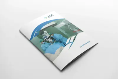
Jakarta Eye Center
Jakarta Eye Center's reputation as a leading eye care network is built on a simple yet powerful philosophy: "Care with Experience". The corporate profile we developed was tasked with bringing this philosophy to life, articulating both their compassionate patient approach and their advanced medical capabilities. The design utilizes a clean, trustworthy aesthetic, combining high-quality photography of medical procedures with fluid graphic elements to guide the reader. Through a structured layout detailing their extensive specialized services, from Refractive Surgery to Glaucoma care, the profile instills confidence and clearly communicates JEC's role as a pioneer in advanced Indonesian eye care.
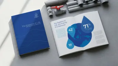
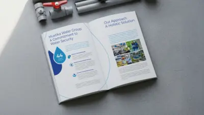
Mustika Water Group
Communicating a subject as vital as water security demands a narrative that is both compelling and clear. For Mustika Water Group, our comprehensive engagement covered the entire project lifecycle, from developing the core story and copywriting to executing the final design, layout, and print production. The visual identity of the document is built around a fluid, wave-like graphic motif, which is subtly brought to life on the cover with a premium spot UV finish on both the pattern and the logo. Inside, a clean layout and impactful infographics work in concert to articulate the group's holistic approach and deep commitment to solving one of the world's most critical resource challenges.
Guna Teguh Abadi
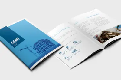
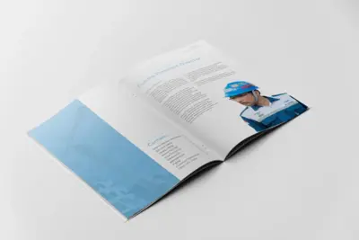
Communicating the immense scale of heavy lifting and industrial construction requires a design language built on clarity and trust. The company profile we developed for GTA Construction was conceived to do just that. Its design framework uses a clean, structured layout and a cool, corporate blue palette to establish a foundation of absolute professionalism. This visual system serves to clearly articulate the company's entire operational scope. The final document projects an image of controlled power, assuring clients that even the largest-scale projects are handled with expert precision.
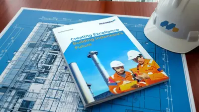
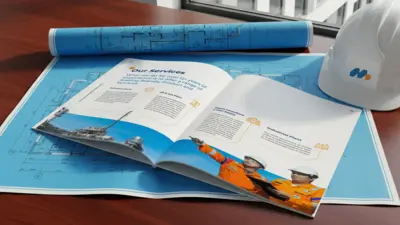
Mucoindo
Our engagement with Mucoindo was a comprehensive brand revitalization project, beginning with the rejuvenation of their corporate logo and visual identity, followed by the development of a new company profile. The project's core theme, "Creating Excellence, Building Indonesia's Future," required a design that was modern, dynamic, and forward-looking. The new company profile utilizes a clean and professional layout, using high-quality photography to showcase their extensive range of services across Infrastructure, Oil & Gas, and Industrial Plants. The design clearly articulates the company's story, creating a powerful communication tool.
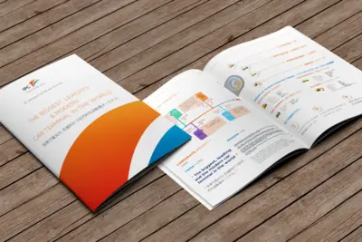
Indonesia Kendaraan Terminal (PELINDO Group)
With a powerful vision to be "The Biggest, Leading, & Modern Car Terminal in the World", Indonesia Kendaraan Terminal required a corporate profile that could match its global ambition. The resulting design is defined by its clean, dynamic aesthetic, using bold color gradients and high-quality photography to create a sense of forward momentum. A crucial feature of the project was its bilingual nature, the layout seamlessly integrates both English and Japanese text to cater to its international partnerships. The profile strategically visualizes key corporate information, including a clear timeline of milestones and a breakdown of the company's values, solidifying IKT's stature as a world-class operator.
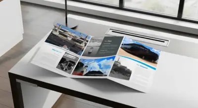
Trans Maritim Pratama
In the complex world of marine transportation, clients need a single, reliable partner. This trifold brochure was conceived to be that first handshake, a concise yet comprehensive introduction to Trans Maritim Pratama as the "One Stop Solution". A dynamic, wave-like graphic motif flows through the pages, guiding the reader from the company's vision and history to their extensive client list and capabilities. The clean, structured layout was specifically designed to distill complex information into a clear narrative of trust.
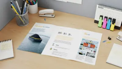
Trans Pacific Jaya
How do you present the full scale of a powerful maritime fleet and shipyard in a single, concise document? This was the question at the heart of the trifold company profile for Trans Pacific Jaya. The answer lies in a design that balances high-impact photography with a highly structured, clean layout. As the brochure unfolds, it reveals a clear narrative of capability, introducing the company, showcasing their extensive fleet of tugs, barges, and floating cranes, and detailing their shipyard operations. Each panel is designed to build on the last, creating a comprehensive yet easily digestible overview of their strengths. The result is a communication tool that is as efficient and powerful as the services TPJ provides.
Momentum Indonesia Investama
To capture the vision of Momentum Indonesia Investama, this company profile was conceived as a clean, professional, and authoritative document. The design is built around a dynamic, wave-like graphic motif that flows through the pages, creating a sense of energy and progress while framing high-quality photography of their maritime operations. The layout is strategically structured to guide the reader through the company's story. This approach results in a powerful communication tool that not only informs stakeholders but also visually reinforces the company's expertise and leadership in the maritime investment sector.
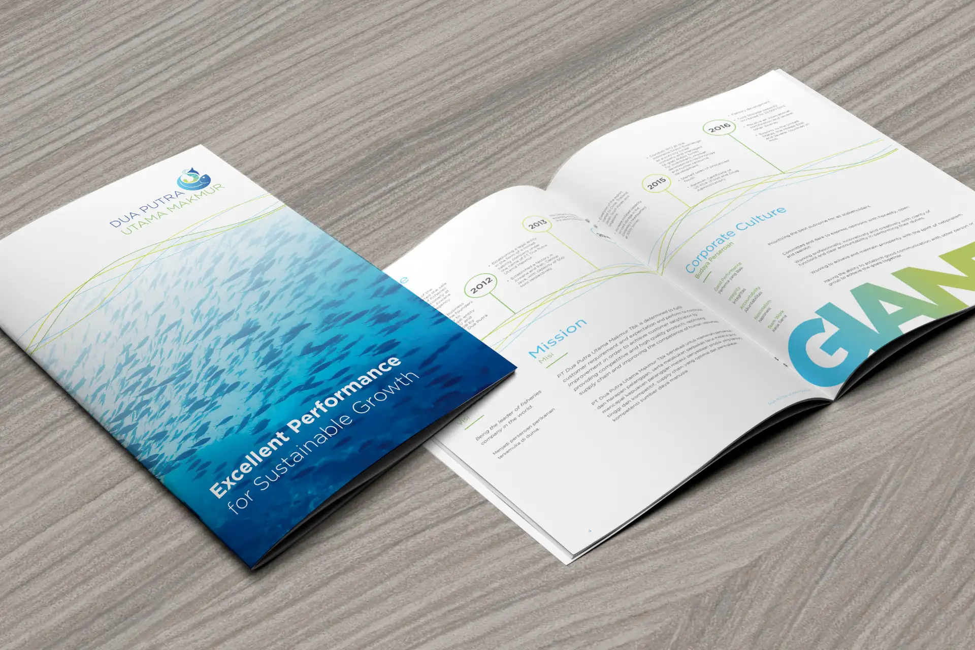
Dua Putera Utama Makmur
A school of fish, moving as one, became the central visual metaphor for the Dua Putra Utama Makmur company profile. This concept of unified strength and forward momentum flows throughout the document, visually reflecting their theme of "Excellent Performance for Sustainable Growth". The design uses clean, wave-like graphic elements and high-quality photography to articulate the company's story, from their corporate milestones to their vision for a sustainable future. The result is a corporate profile that is as fluid and dynamic as the ocean itself, powerfully communicating the company's leading role in the marine products industry.
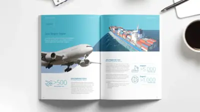
Han Lintas
A modern logistics partner needs to communicate one thing above all: absolute reliability. For Han Lintas International, we were tasked with creating a company profile that would serve as their "Gateway to Global Business Excellence". Our end-to-end role encompassed strategic copywriting, professional photography of their team and fleet, and a clean, modern design. The final document is built on a structured layout, using powerful data visualizations and a geometric design language to clearly articulate their scale, network, and unwavering commitment to excellence in global freight forwarding.
Murphy Oil Indonesia
How does a global energy player demonstrate its deep commitment to local operations? This was the central narrative driving the design of the Murphy Oil brochure. The visual language we created answers this question with bold confidence. A dynamic, color-blocked layout separates their international scope, highlighting "Regional Success" in Australia and Malaysia, from their specific "Local Focus" in Indonesia's South Barito Block. High-impact photography of their massive offshore facilities showcases their global scale, while the structured information design articulates their expertise on the ground.
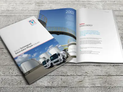
Dinar Energy
The story of Dinar Energy's transformation into a trusted fuel oil trading company required a company profile that projected both professionalism and scale. Our design centers on the theme "Solusi Terintegrasi Bahan Bakar Minyak Industri" (Integrated Solution for Industrial Fuel Oil), using a clean, corporate aesthetic to build a strong brand narrative.
Infinitie Berkah Energi
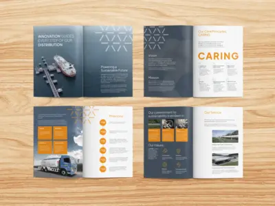
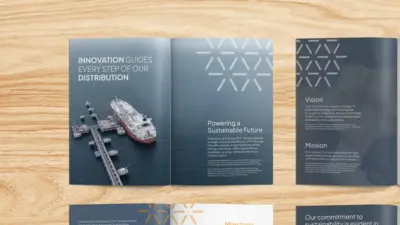
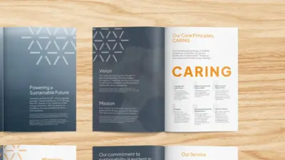
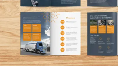
Infinitie Berkah Energi positions itself not merely as a fuel provider, but as a key architect of a sustainable energy future. Their company profile needed to reflect this forward-thinking vision, conceived as a narrative document that articulates how "Innovation Guides Every Step of Our Distribution". The visual language is built around a distinctive geometric pattern, symbolizing interconnectedness and progress. This motif, paired with a clean, modern layout, serves as a confident declaration of their mission to become a true game-changer in Indonesia's energy transition.
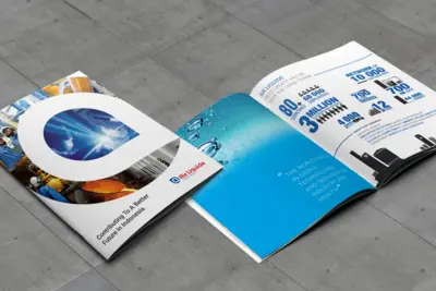
Air Liquide Indonesia
How do you visually represent something as essential yet often invisible as industrial gas? This was the creative challenge for the Air Liquide Indonesia company profile. Our narrative solution was to focus on the immense scale and tangible impact of their contributions to the nation. The design is anchored by a dynamic, teardrop-shaped graphic, a visual metaphor for a single molecule, that frames scenes of their technology in action. This motif guides the reader through a powerful infographic spread, detailing their vast network, innovative patents, and diverse gas solutions for critical industries, from healthcare to manufacturing.
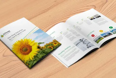
Asia Clean Energy
A sunflower, a natural engine of energy, became the central visual metaphor for the AC Energy company profile. This optimistic and sustainable image anchors their core message as a "One Stop Solution" for clean gas engine technologies, reflecting a deep commitment to a better energy future. The design was conceived to mirror this balance between nature and innovation. Inside, a clean and professional layout uses a bright, natural color palette to articulate the company's story, detailing their corporate milestones, stringent quality policies, and core values like Eco-consciousness and Accountability.
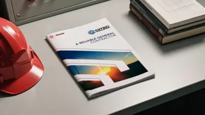
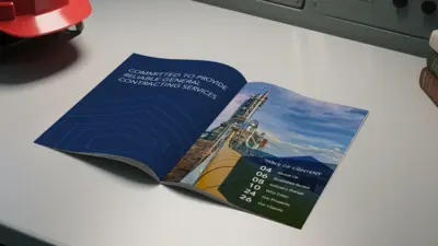
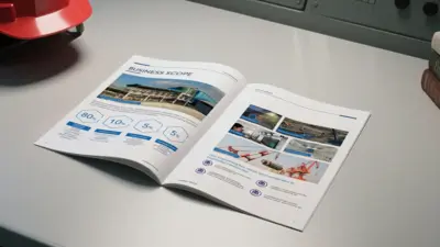
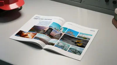
Citec Engineering Indonesia
For a general contractor like Citec Engineering, communicating reliability is paramount. As a joint venture backed by global industrial leaders Sinoma and CNBM, their company profile needed to project a profound sense of structure, commitment, and trust. Our design solution translated these values into a clean and highly structured visual language. The profile is built on a foundation of modern typography and a professional blue color palette, using thin linework motifs to evoke a sense of precision engineering. The document strategically articulates their entire business scope and industry range, from power plants to mining, building a compelling case for their core promise: to be "A Reliable General Contractor".
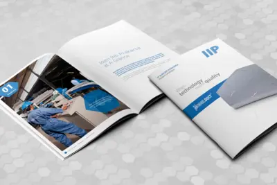
Idjen Inti Prakarsa
Idjen Inti Prakarsa product catalogue required a design that was clean, technical, and highly professional. The project's goal was to clearly articulate the specifications and benefits of their innovative Modulduct™ system. The design utilizes a crisp, modern layout with a distinctive hexagonal pattern motif, creating a visual language that feels both scientific and structured. The catalogue is strategically organized to guide users from a company overview to detailed product specifications, showcasing their PIR Sandwich Panels and a wide array of accessories.
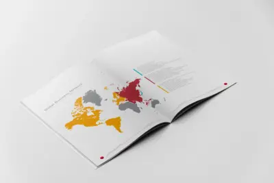
Ferrostaal
Ferrostaal's ethos, "Turning Ideas into Reality", demanded a company profile that could convey both immense technical capability and unwavering professionalism. The document we produced is built on a foundation of clean, structured design, using a sophisticated layout and powerful industrial photography to guide stakeholders through Ferrostaal's complex world. The narrative clearly articulates their global footprint via world maps while detailing their core competencies and technological independence as an EPC contractor. Each page is designed to build a story of trust, scale, and meticulous execution.
Elsewedy Electric Indonesia
Power transformers are the heart of the electrical grid, complex, powerful, and built on precision. The task for this company profile was to capture that essence of advanced engineering in a clean and compelling document. A visual language of clean lines and structured layouts was developed to reflect this technical precision. A subtle, curved graphic motif flows through the pages, framing high-impact photography of their state-of-the-art facilities and products. The narrative guides stakeholders through Elsewedy Electric's world, from their core competencies and rigorous laboratory testing facilities to their impressive global export portfolio, detailed with clear infographics.
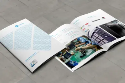
Westindo Indonesia
Behind every enduring business is a source of reliable power. This company profile was conceived to position Westindo as that essential, unseen engine for their clients. The design language builds on a foundation of trust and precision, utilizing a clean, corporate aesthetic. A subtle, repeating pattern derived from the Westindo logo is featured on the cover, creating a visual metaphor for a stable and interconnected network. Inside, the brochure clearly articulates their diverse offerings, from sophisticated DC Power Supplies to partnerships with global leaders like Hitachi, assuring clients of Westindo’s capability to power their success.
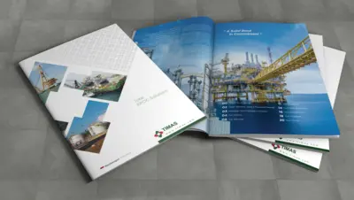
Timas Suplindo
Timas Suplindo's core principle, "A Solid Bond in Commitment", required a physical form that felt as strong and reliable as their promise. This corporate profile achieves that through a sophisticated and tactile design. The cover makes a subtle yet powerful first impression, featuring a blind spot UV pattern created from the Timas logo, adding a layer of premium texture. Inside, the design uses a dynamic, ascending block motif to frame high-impact photography of their massive onshore and offshore projects. This structured visual journey guides stakeholders through their story as a provider of "Total EPCIC Solutions", clearly articulating their history, services, and extensive capabilities. The final document is more than a profile, it is a tangible representation of the company's solid commitment to excellence in the energy industry.
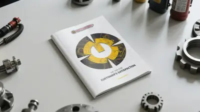
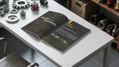
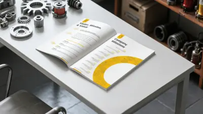
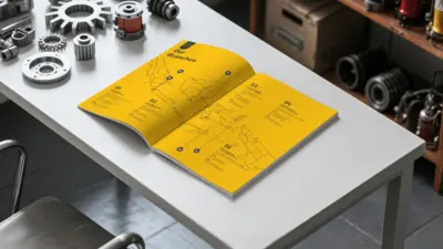
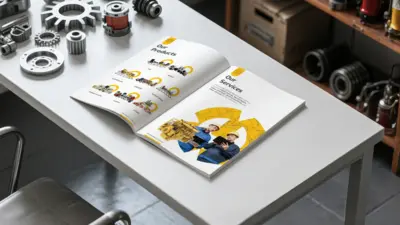
Bima Utama
The gear is the heart of the machine, a symbol of precision, power, and essential connection. This powerful motif became the core of the visual identity for the Bima Utama Group company profile. On the cover, the gear acts as a window, revealing intricate technical drawings of the high-quality spare parts they provide. This visual language flows throughout the document, framing key information from their two-decade history and company milestones to their extensive product and service offerings for brands like Caterpillar and Cummins. The entire document was conceived to reinforce their commitment to being a reliable and essential partner, visually embodying their role as a critical component in their customers' success.
Drillmaster
The core challenge for the Drillmaster Utama Indonesia company profile was to visually represent their extensive capabilities as a general engineering contractor for the oil and gas industry. The design solution centered on a clean, professional, and modern aesthetic, utilizing high-impact photography of their large-scale projects to create a sense of power and reliability. The profile effectively guides the reader through key corporate information, starting with "Drillmaster Utama Indonesia At a Glance" and detailing their extensive services and operational expertise. The design uses a strong, structured layout and clear typography to articulate their story and capabilities, resulting in a corporate communication tool that not only informs but also projects the company's significant stature and commitment to excellence.
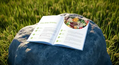
Inti Everspring Indonesia
The cover of the Inti Everspring profile immediately conveys a sense of modern protection. A large, circular supergraphic, evoking contoured farm fields, is enhanced with a tactile, dotted spot UV finish that creates a premium first impression. This visual language of layered protection and growth continues inside, where the document articulates their identity as a "One Stop Solution" for the agrochemical industry. The clean layout clearly presents their core values, state-of-the-art facilities, and comprehensive services, solidifying Inti Everspring's position as a reliable, pioneering partner in crop protection.
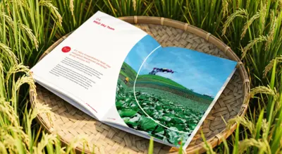
MKD
A layered arch, evoking both rolling hills and a rising sun, forms the central visual narrative for the Mitra Kreasidharma company profile. This graphic motif symbolizes the company's 30-year journey of growth while looking toward a new horizon of innovation. The profile's clean layout articulates this duality, showcasing their impressive milestones alongside modern capabilities, including the "MKD Sky Team" for Industry 4.0 farming. The result is a cohesive story of an established market leader that continues to pioneer the future of Indonesian agriculture.
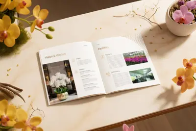
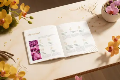
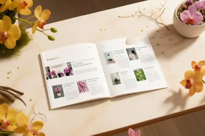
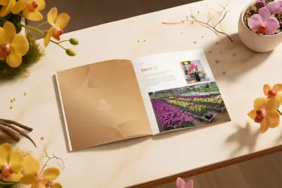
Ekakarya
Our engagement with Eka Karya, a leading grower of Phalaenopsis orchids, was a comprehensive brand revitalization project. The journey began with the foundational development of their new logo and corporate visual identity, designed to reflect the elegance and delicate nature of their craft. This new identity blossoms on the cover of their company profile, which features an intricate, flowing line pattern inspired by the petals of an orchid, rendered in a tactile blind emboss. The new logo sits at its heart, finished in a premium bronze gold hot foil. Inside, the document we wrote, designed, and produced articulates their story, from their vision and state-of-the-art facilities to their exquisite product collections. The result is a brand narrative that is as beautiful and sophisticated as the orchids they cultivate.
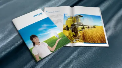
Shukaku Indonesia
"Shukaku", the Japanese word for "harvest", is the philosophical seed of this entire company profile. The design translates this principle into a modern context, blending visuals of vast, golden fields, symbolizing reward, with icons of technological innovation, like the energy-saving lightbulb. The clean, dynamic layout guides the reader through their "Filosofi Panen" (Harvest Philosophy), creating a corporate narrative that is as much about diligent growth as it is about smart, modern solutions.
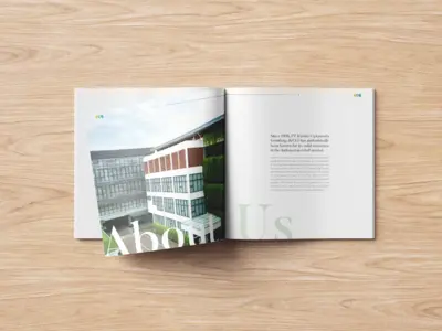
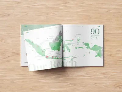
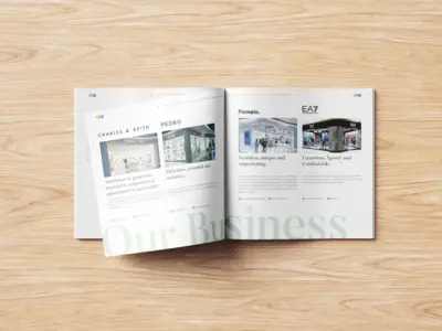
Kurnia Ciptamoda Gemilang
As the trusted Indonesian partner for world-class lifestyle brands like Charles & Keith, Pedro, and EA7 Emporio Armani, Kurnia Ciptamoda Gemilang (KCG) required a corporate profile that reflected their own standard of excellence. The design is built on a foundation of clean, minimalist sophistication, featuring a subtle, faceted graphic motif that flows throughout the document. The narrative articulates their impressive scale, with over 90 stores nationwide, through a stylized map of their reach. Since their establishment in 1998, KCG has built over 25 years of experience, positioning them not just as a retailer, but as expert brand builders in a dynamic market. The final document is as polished and aspirational as the global brands they represent.
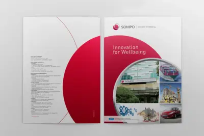
Sompo Insurance
A circle, a universal symbol of unity and protection, forms the central visual narrative for the Sompo Insurance company profile. This motif flows throughout the document, framing their story of "Innovation for Wellbeing". The clean, authoritative layout is designed to articulate the full scale of their operations, from an extensive global business network and a detailed historical milestone timeline to their foundational group policies. The result is a corporate document that feels both globally significant and deeply committed, visually reinforcing Sompo's promise to protect and support the wellbeing of their clients.
LIG Insurance
How does an insurance company translate its promises into a visual identity? For LIG Insurance, the answer lies in a spectrum of color and commitment. The company profile is built around their "3 Promises for The Better Future": Orange for Service, Blue for Partnership, and Green for Family. This color-coded philosophy becomes the document's design language, guiding the reader through a story of trust and reliability. The narrative is backed by a long history of milestones dating back to 1959 and strong financial highlights, visually assuring clients that their future is in secure and caring hands.
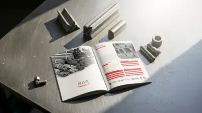
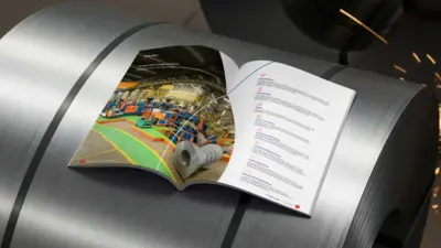
Gunung Steel Group
How do you capture the immense power of the steel industry while communicating technical precision? This product catalogue for Gunung Steel Group answers that question with a design that is both strong and sophisticated. The visual language is anchored by a dynamic, curved motif that frames powerful industrial photography, reflecting the company's theme of "Shaping The Future of Steel Industry". Inside, this clean aesthetic provides a clear framework for complex information, from a detailed "Production Workflow" infographic to precise product specifications for their bar and coil products.
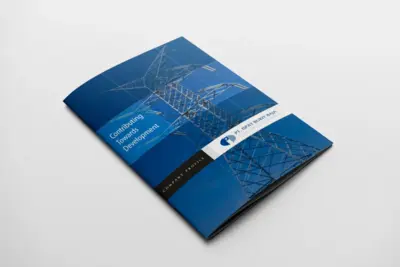
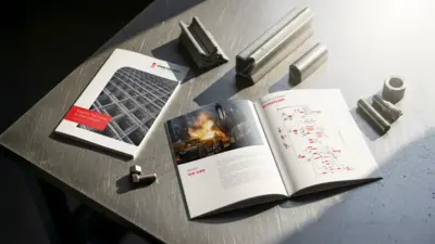
Ispat Bukit Baja
Ispat Bukit Baja's role as a foundational pillar in national development required a company profile that projected unwavering strength and stability. The design language we developed is built on a clean, rigid grid system, mirroring the structural integrity of their steel products. This framework allows for the clear presentation of highly technical information, from their detailed production processes to extensive product specification tables for U-Channels and Equal Angles. The entire document serves as a testament to their core promise: "Contributing Towards Development" with precision and reliability.
Cakung Prima Steel Group
The task for this company profile was to present Cakung Prima Steel not just as a single entity, but as a powerful group of companies leading the steel wire market. The design uses a clean, structured layout with bold color blocking to introduce each company within the group and articulate their collective strength. High-quality photography showcases the diverse applications of their products, from national infrastructure to the automotive industry. The narrative is built to tell a story of longevity and leadership, creating a communication tool that solidifies their reputation as a foundational pillar in Indonesia's industrial landscape.
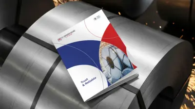
Papa Jaya Agung
A dynamic, circular supergraphic anchors the rolled steel products of the Papajaya Agung, symbolizing focus, precision, and the company's core promise of being "Trust & Reliable". Our comprehensive role spanned from content writing and photography, creating a layout that guides the reader through their extensive company milestones and diverse services for industries like oil and gas. The final document is a cohesive and confident statement, reinforcing their stature as a trusted partner in the steel industry.
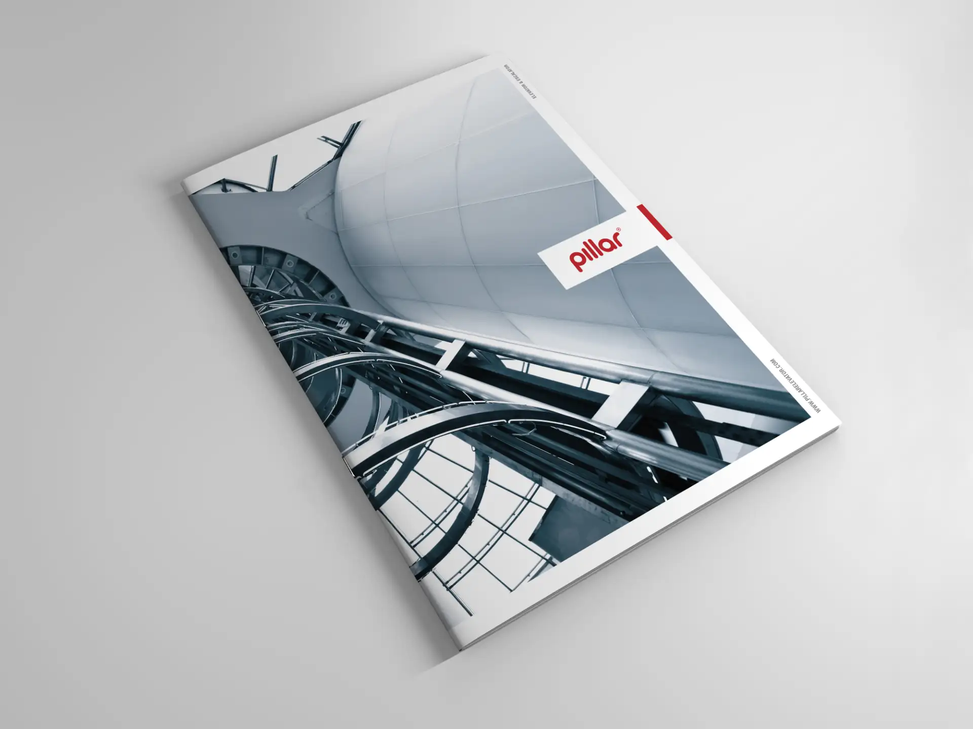
Pillar Elevator
Vertical transportation is a world of precision engineering and architectural integration. The company profile for Pillar was conceived to reflect this high-stakes environment, balancing technical detail with a clean, modern aesthetic. A strong, grid-based layout and a confident red and grey color palette create a sense of structure and reliability. The document is designed as a clear journey through their capabilities, showcasing their full range of products, from specialized "Hospital" and "Observation Elevators" to escalators and travelators. The final piece is a testament to their expertise, presenting Pillar not just as a product supplier, but as a comprehensive partner in modern architectural solutions.
Sheitai Industrial
Die casting is a world of immense pressure and fine tolerances. This company profile for Shei Tai Industrial was conceived to mirror that environment of precision. A clean, highly structured layout and detailed product photography serve as a visual catalog of their extensive "Product Lines Up" for intricate engine and transmission parts. The entire document is a testament to their manufacturing prowess, presenting complex industrial capabilities with absolute clarity and confidence.
Inti Presisi Toolsindo
Precision is a world measured in microns. For Inti Presisi Toolsindo, a manufacturer of high-performance tools for the aerospace and automotive industries, their company profile had to embody this same standard of exactitude. The design language utilizes sharp, angular graphics and a clean, technical layout to mirror the fine tolerances of their products. This structured framework serves to clearly articulate their global vision and showcase their extensive product lines, from special carbide cutters to precision drills. The final document is a confident reflection of their brand: a powerful, precise, and indispensable partner to the world's most demanding industries.
From your company profile to your sales brochures, your corporate collateral defines your brand in the hands of your audience. Let's create a suite of tools that communicates with clarity and impact.