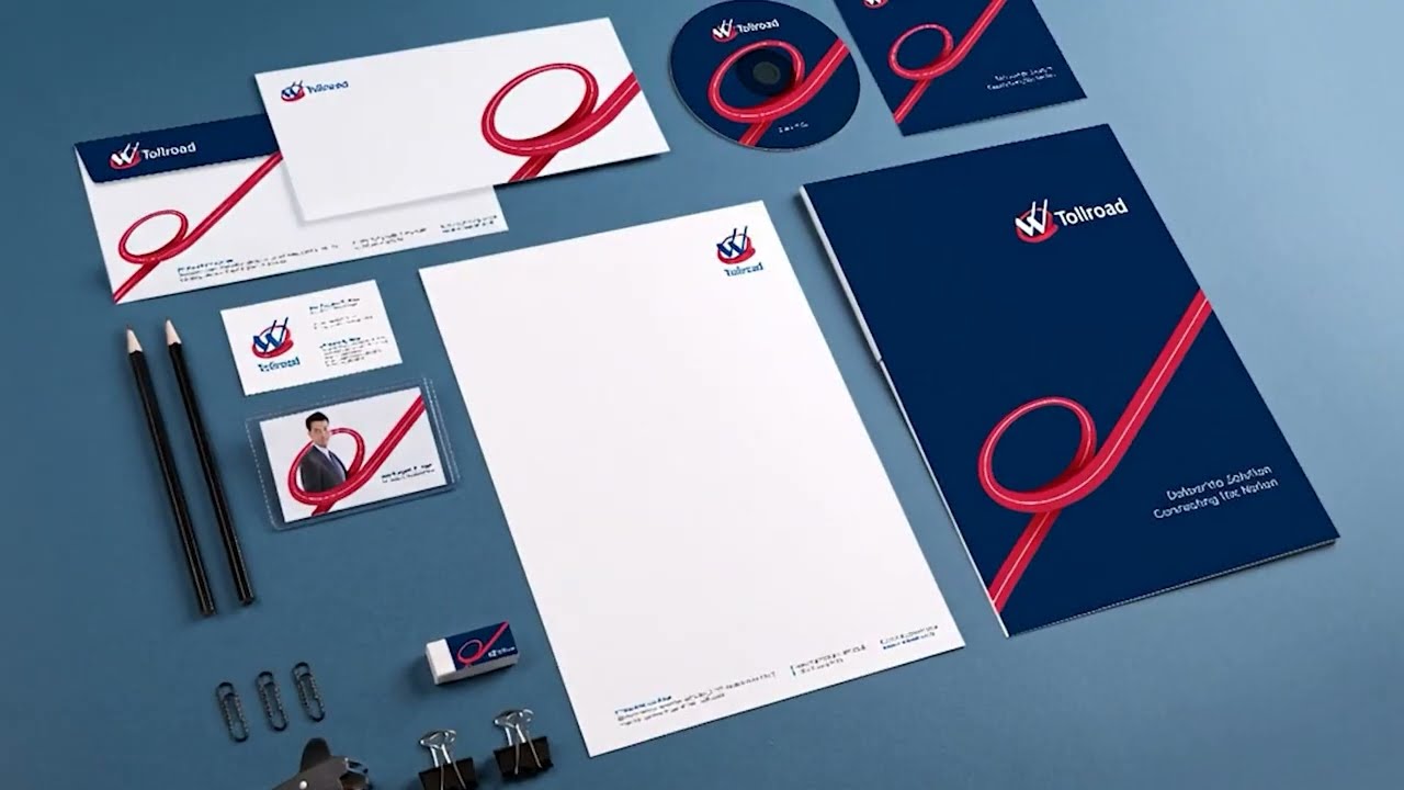
Waskita Toll Road
Waskita Tollroad's mission is monumental: "Connecting the Nation". They required a new logo and visual identity that could embody this spirit of seamless connection and forward momentum. Our solution is centered on a powerful and fluid supergraphic, a continuous red line that loops and flows, representing the endless roads and connections they build. From the new logo to a comprehensive brand guideline, we developed a cohesive identity that was applied across all corporate touchpoints, including company profiles, stationery, and digital platforms. The final result is a modern, dynamic, and instantly recognizable brand identity that powerfully communicates Waskita Tollroad's role as a key architect of national connectivity.
Interport
As a key logistics partner within the Indika Energy Group, Interport required a visual identity that could embody their promise of a "Seamless Logistics Solution". The creative core of our solution is a fluid, wave-like supergraphic, composed of two intertwined lines symbolizing flow and partnership. This dynamic element, born from the new logo we designed, becomes a versatile visual thread across all brand applications, equally powerful whether debossed on premium stationery or applied to industrial assets like shipping containers. The final result is a modern, memorable, and trustworthy brand identity that clearly communicates Interport's role in the complex world of logistics.
Tang
The challenge for the iconic 2Tang brand was to evolve for the future by creating a new, modern mother brand: 'Tang'. This required a complete identity rejuvenation, moving away from a literal, industrial past towards a more sophisticated and abstract visual language. Our design solution began by deconstructing the old logo's literal pliers ('tang'). The new logomark is an elegant, abstract representation of two pliers, capturing the essence of the product while creating a timeless and dynamic symbol. Housed within a modern, tea-tin-shaped enclosure, the new identity is confident and premium, a successful brand transformation providing a strong foundation for the future of the Tang and 2Tang family of products.
The Blacksteel Group
A name like "Blacksteel" demands a visual identity that communicates unwavering strength and modern sophistication. This was the starting point for our comprehensive brand identity design for the leading real estate developer. The new identity is built around a powerful, geometric 'BS' monogram that evokes a sense of architectural structure and precision, paired with a clean and dynamic custom wordmark. The final logo, often presented as a high-performance chrome emblem, is a testament to the quality and durability of their developments, a timeless and authoritative mark for a leader in Indonesia's commercial property sector.
Graha Trans
As a leading, publicly listed logistics company, Graha Trans required a new visual identity that could project a modern, dynamic, and trustworthy image. The logo we designed is built around a powerful 'GT' monogram, where the 'T' cleverly forms a forward-facing arrow, a clear symbol of progress and movement. This concept is extended into a fluid supergraphic used across all corporate collateral, from business cards to the fleet of container trucks. The final result is a cohesive and confident brand identity system that powerfully communicates their vital role in keeping Indonesian commerce in motion.
Cheetah Safety
The mission for Cheetah Safety Wear was to create a logo that communicated more than just safety, it needed to convey speed, agility, and high performance. Our design solution is a powerful and dynamic logomark that captures a cheetah in mid-sprint, its form fluid and full of energy. This abstract mark is paired with a strong, bold wordmark to create a sense of power and reliability. The final logo successfully positions the brand as a provider of superior protective equipment that enables workers to perform their tasks with confidence and agility.
AIPA (Asean Inter-Parliamentary Assembly)
Creating a unified visual identity for the ASEAN Inter-Parliamentary Assembly (AIPA), an organization representing ten diverse nations, required a symbol rich with meaning and purpose. The new logo we designed is built on multiple layers of symbolism: the form suggests a 'Raising Hand' representing the people's voice, while its five interconnecting ribbons embody the unity and solidarity of the ASEAN community. This meaningful mark became the heart of a comprehensive visual identity system, applied consistently across all ten member nations on everything from flags to official stationery. The result is a modern and dignified identity that powerfully communicates AIPA's vision of "one vision, one identity, one community."

Indokemika Group
As a key member of the Salim Group, Indokemika required a new visual identity that could reflect its position as a leading chemical manufacturing and distribution company. The new logo we designed is centered on a clean, modern laboratory flask icon, set within a dynamic series of concentric rings. This mark symbolizes scientific precision and the company's radiating impact on various industries. The professional red and blue color palette was applied across their corporate identity, creating a brand that feels reliable, modern, and scientifically advanced.
SSK-E
To launch SSK Tama's new division in the electric vehicle sector, a dynamic and forward-thinking brand identity was essential. The mission for SSK-E was to create a look that instantly communicated "Electric Vehicle Charging Solution". Our solution is a dual-logo system: the established 'SSK' mark paired with a new, vibrant green 'E' that cleverly incorporates an electric plug into its form. This iconic 'e-plug' becomes the core of the new identity, applied across all touchpoints from business cards to the EV charging stations themselves, perfectly positioning the brand to lead in the future of mobility.
Ekakarya
The mission for Ekakarya, a leading grower of Phalaenopsis orchids, was to create a logo that could embody their tagline: "Orchid at its best". The new visual identity needed to be as elegant and sophisticated as the flowers they cultivate. Our solution is a clean and graceful logomark, a stylized, monoline orchid with three interconnected petals, symbolizing nature's perfect geometry. Paired with a modern wordmark and rendered in premium applications like backlit signage, the new identity successfully positions Ekakarya as a benchmark of quality and beauty in the world of horticulture.
Larazeta
Larazeta required a brand identity that could transport guests to the heart of the Middle East, evoking a sense of authentic cuisine and warm hospitality. The centerpiece of the identity is the custom logotype we designed. Its flowing, calligraphic letterforms are inspired by the elegance of Arabic script, creating a mark that is both exotic and inviting. This bilingual logo, presented in a warm, glowing application against ornate architecture, sets the tone for a premium dining experience that perfectly blends tradition with modern sophistication.
Serbaraso
The mission for Serbaraso was to create a brand identity that honors the rich heritage of "Masakan Padang" while presenting it in a fresh, modern context. The new logo is a dynamic fusion of symbol and text. A stylized fish, a staple of the cuisine, is cleverly integrated into the 'S' of the wordmark, while the logo's angular flourishes subtly evoke the iconic rooftops of Minangkabau architecture. Rendered in a warm, appetizing color palette, the final identity is a powerful and modern tribute to one of Indonesia's most beloved culinary traditions.
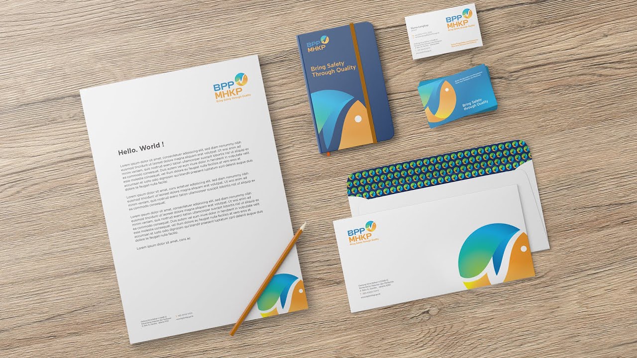
Badan Pengawas dan Pengendalian Mutu Hasil Kelautan & Perikanan
The mission for BPPMHKP, Indonesia's quality control agency for marine and fishery products, was to create a new visual identity that felt modern, dynamic, and trustworthy. The new logo we designed is centered on a fluid, abstract swoosh that evokes both a fish and a wave, symbolizing the vibrant marine ecosystem. This new mark became the heart of a comprehensive visual identity system, applied across everything from official stationery to pylon signage, powerfully communicating their core mission to "Bring Safety through Quality."

Xpress Air
The challenge for Xpress Air was to create a new visual identity and aircraft livery that felt both dynamic and elegant. The centerpiece of our design is a graceful, stylized bird in flight, its form crafted from flowing ribbons of red and gold to symbolize speed and grace. We extended these ribbon-like lines from the logomark across the aircraft's fuselage and tail fin, creating a powerful sense of movement and a distinctive visual signature in the sky. The final livery is a beautiful and modern identity that elevates the airline's brand presence.
Alien Golf
With a name like 'Alien Golf', the logo needed to be both clever and premium, suggesting technology that is truly 'out of this world'. Our solution is a minimalist and highly conceptual logomark that brilliantly fuses two ideas into one: a stylized alien head whose eyes are simultaneously shaped like the top of a golf driver. This single, iconic mark is paired with a sophisticated serif typeface to create a feeling of advanced performance. The final logo is a memorable and intelligent brand identity, perfectly suited for a company looking to make a unique impact in the competitive golf equipment market.
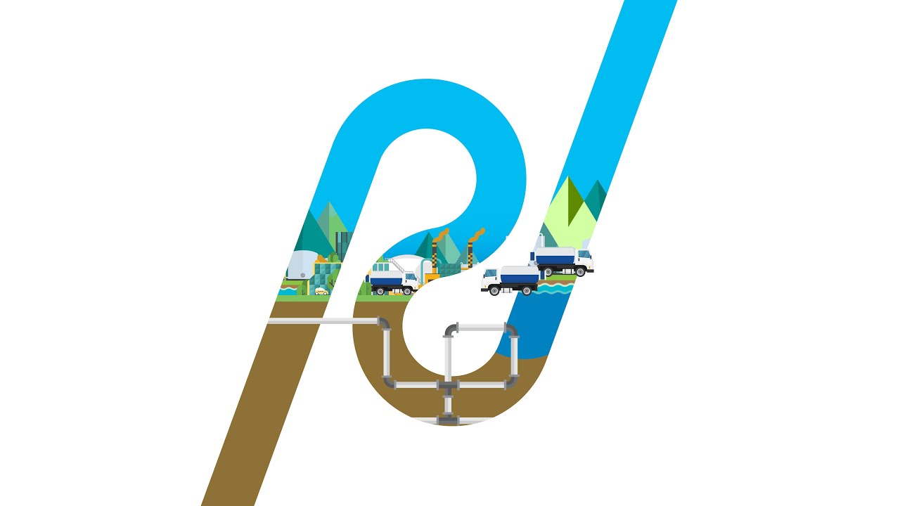
Pal Jaya
The mission for Perumda Pal Jaya, Jakarta's vital wastewater management utility, was to create a new visual identity that felt modern, clean, and trustworthy. The logo we designed is a fluid and intelligent mark, combining the letters 'P' and 'J' into a symbol that represents the continuous flow of water and their end-to-end service cycle. This new identity was rolled out into a comprehensive visual system, applied across everything from corporate stationery to their large fleet of service vehicles, powerfully communicating their commitment to a healthier Jakarta.
POSB Reksabumi
PT Interport Reksabumi operates at the critical intersection of Engineering & Construction (E&C) and Port Logistics. They required a brand identity that could symbolize the synergy between these two powerful industrial sectors. The logo we designed is an elegant, abstract mark of this integration. Its two interconnected, leaf-like forms serve as a visual metaphor for the connection between land-based construction and sea-based logistics, forming a seamless loop of service. Paired with a solid, professional typeface, the final identity projects a sense of organic growth and grounded reliability, perfectly positioning them as a provider of integrated industrial solutions.
Magdatama
The brand identity for Magdatama was born from their core tagline: "Connecting Possibilities". The new logo we designed is a direct visualization of this idea, a fluid, continuous red line that forms a dynamic, infinity-like symbol. This single, powerful mark became the heart of their entire visual system. We extended this ribbon-like graphic into a versatile supergraphic, applied consistently across all touchpoints, from their corporate stationery to the architectural accents on their building. The result is a cohesive and modern brand identity that perfectly embodies their mission to seamlessly connect and create new possibilities.
Mucoindo
With an ambition of "Aiming to be the Best," Mucoindo required a brand identity that projected confidence and technical expertise. The logo we designed is a strong, modern monogram, a stylized 'M' constructed from bold, geometric building blocks. This architectural mark, paired with a dynamic blue and orange color palette, became the foundation for their entire visual system. Applied across all touchpoints, from hard hats to business cards, the new identity is a clear and powerful statement of their commitment to creating excellence and building Indonesia's future.
Dipa Healthcare
The rebranding for Dipa Healthcare was born from their core mission: "To Improve The Quality of Life". The new visual identity is centered on a clean and modern logomark, a star-like spark within a circle, symbolizing health, hope, and the human element. This central icon was developed into a sophisticated pattern, creating a unique and memorable brand texture for their corporate collateral. Paired with a professional red and grey color palette, the final identity system is a powerful reflection of their commitment to being a leading, trusted name in the healthcare industry.
Heritage Living
Creating an identity for "Heritage Living" required a design that felt both timeless and exceptionally luxurious. The new brand is built around a sophisticated and elegant 'HL' monogram, where clean, classic lines intersect to form a mark of distinction. This monogram was then used to create a custom, debossed pattern, adding a layer of subtle, tactile texture to their corporate collateral. Rendered in a striking gold foil on premium black stock, the final identity is the epitome of understated luxury, perfectly positioning Heritage Living at the pinnacle of the premium lifestyle market.
Neopoly AI
Neopoly·ai operates at the cutting edge of science, using artificial intelligence to discover the advanced materials of tomorrow. They required a brand identity that felt equally futuristic and organic. The visual language we created is built around a fluid, vibrant supergraphic that mimics the behavior of polymers, with a color palette that speaks to both nature and technology. This core element, paired with a clean, modern wordmark, forms a flexible identity system that articulates their pioneering role in "the Future of Material Discovery". The result is a brand that looks as intelligent and innovative as the AI that powers it.
Intertec
Our comprehensive engagement with this client began with a strategic brand naming process, resulting in "Intertec". The new brand identity needed to embody their role as a "Reliable IT Distribution Company". The logo we designed is centered on a dynamic, circular mark of three orbiting swooshes, symbolizing a continuous network and the constant flow of technology. A bold red and orange color palette projects energy and confidence. The final brand identity is a powerful and modern system that perfectly positions Intertec as a central, reliable hub in the IT distribution ecosystem.
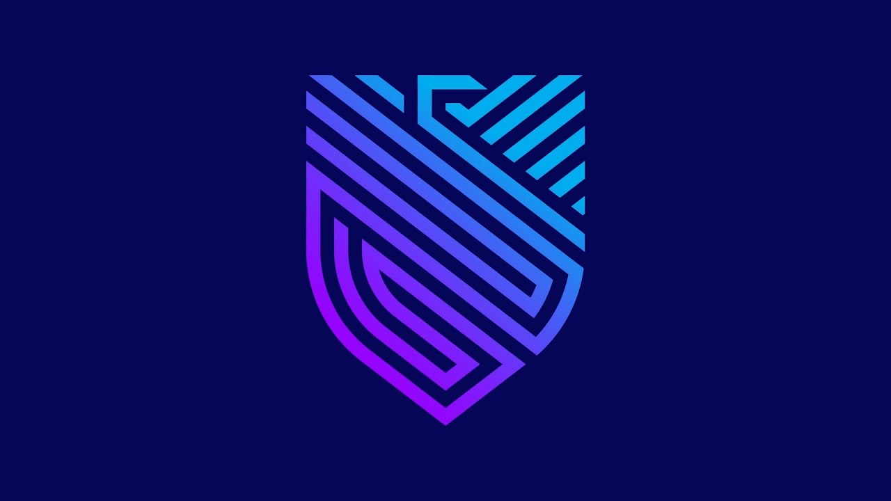
Systema
Systema Global Solusindo required a brand identity that could visually represent their expertise in "High-Profile Cyber Security". The design needed to project an image of an impenetrable, intelligent, and modern defense system. The new logo we created is a stylized shield, constructed from interconnected geometric lines that evoke a sense of a complex digital fortress. This circuit-like pattern was expanded into a dynamic supergraphic, applied across all touchpoints with a futuristic blue and purple gradient. The final brand identity is a powerful and sophisticated visual language that communicates security, intelligence, and trust.
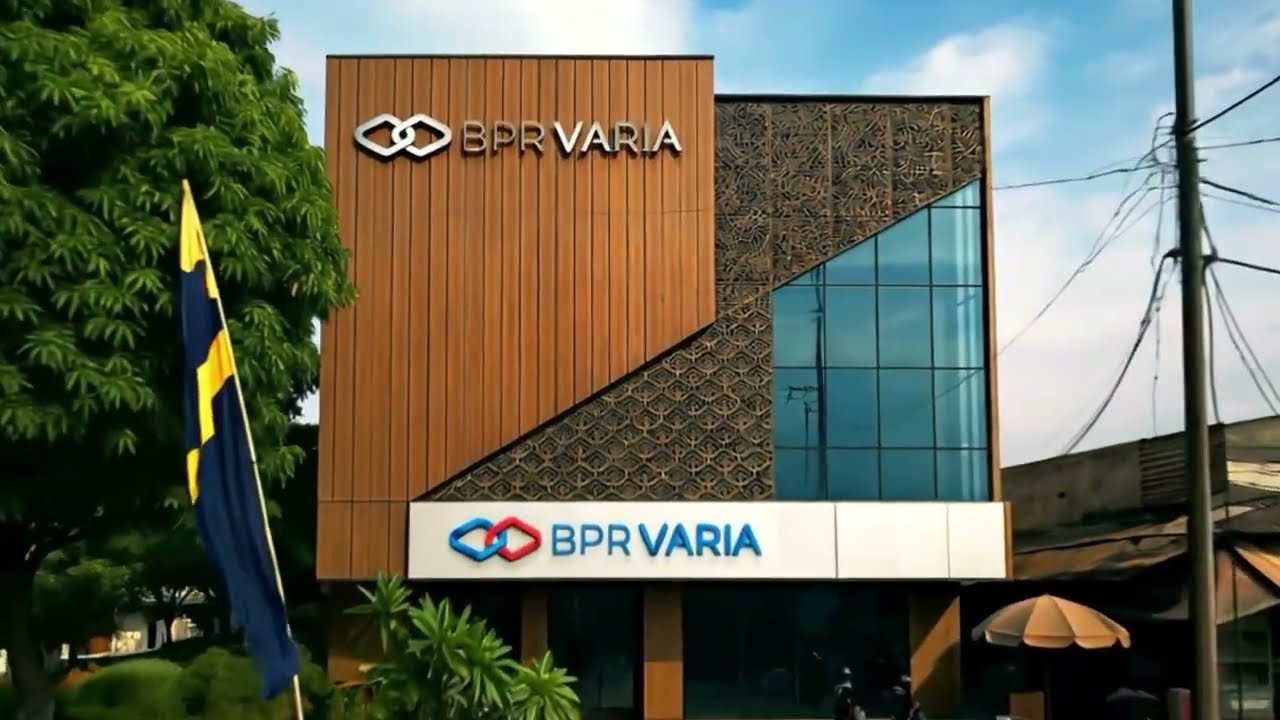
BPR Varia
The mission for BPR Varia was to create a brand identity that embodies their role as a trusted financial partner for the community. The new logo we designed is centered on a powerful and simple concept: two interlocking links, symbolizing the strong, secure, and collaborative bond between the bank and its customers. This core mark was then expanded into a sophisticated visual system, including a dynamic repeating pattern for various brand applications. The final identity is modern, trustworthy, and friendly, perfectly positioning BPR Varia as a reliable partner in their customers' financial journey.
Altira Business Park
The brand identity for Altira Business Park was born from its core promise: to be a place "where business grows!". The logo we designed is a direct visual translation of this idea, a modern, abstract mark that is simultaneously a blossoming flower and a prestigious building. This concept of growth and opportunity is extended into a dynamic supergraphic system, applied to large-scale environmental graphics like construction barricades. The fresh blue and green color palette reinforces a feeling of sustainability and new possibilities, creating a confident and optimistic visual language for a truly modern business hub.
MS Indonesia
The mission for MS Indonesia was to create a powerful and modern brand identity that could represent their scale and efficiency in the industrial sector. The new logo we designed is a bold, technical 'MS' monogram, constructed from a single, continuous looping line. This fluid form symbolizes a seamless process and an interconnected network, the core of a modern logistics or manufacturing operation. This new identity was designed to be highly impactful on large-scale applications, from building facades to a fleet of container trucks, projecting a clear message of strength, precision, and reliability.
Park Hotel
The vision for Park Hotel, a key hospitality asset of PP Properti, was to create a brand that felt like a serene urban oasis. Our comprehensive engagement began with designing a new logo and a complete visual identity system that projected modern comfort and tranquility. This new identity was meticulously applied across all guest touchpoints, including the detailed design of in-room amenities. The final result is a cohesive and welcoming brand experience that provides a refreshing respite from the bustling city.

Best-Western Hotel
A seamless guest experience begins with clear and intuitive navigation. For the internationally recognized Best Western Hotel in Jakarta, we were tasked with designing a complete signage and wayfinding system. The project required a deep understanding of guest flow and brand consistency. Our solution was a system of signs and environmental graphics that is both fully compliant with Best Western's global brand standards and perfectly tailored to the unique architecture of the property. The final result is a clear, cohesive, and user-friendly wayfinding system that helps guests navigate the hotel with ease and confidence.
Primebiz Hotel
Primebiz Hotel was conceived by Prime Plaza Hotels & Resorts to specifically cater to the modern business traveler. The brand identity we created needed to embody this focus on efficiency, connectivity, and professionalism. The new logo and comprehensive visual system are clean, smart, and functional, creating a visual language of productivity. Our work extended to designing a full suite of in-room amenities, ensuring a consistent and thoughtful brand experience at every touchpoint. The final identity successfully positions Primebiz as the intelligent choice for travelers who value a seamless blend of work and comfort.
TransAsia Minerals Ltd.
The mission for Trans-Asia Resources was to create a brand identity that reflected their stature as a sophisticated global resource investor. The new logo we designed is a clean, modern, and intelligent mark, a stylized sphere with an internal spiral, evoking a globe, a mineral cross-section, and a vortex of strategic activity. This powerful symbol, paired with a subtle, repeating brand pattern, was applied across their corporate identity, from premium business cards to industrial safety helmets. The result is a versatile and authoritative brand identity, perfectly suited for a company operating on the world stage.
Modern Nickel
For Modern Nickel, a key asset of the Modern Group, the brand identity needed to project a vision that was both industrially powerful and environmentally conscious. The new logo we designed is a vibrant, globe-like sphere, with dynamic blue and green swooshes that symbolize the earth and a commitment to sustainability. This energetic mark became the heart of a comprehensive visual system, applied across corporate and industrial touchpoints like business cards and safety helmets. The final identity is a confident and forward-thinking brand, perfectly positioning Modern Nickel as a key player in providing a mineral essential for a greener future.
Indowana
The mission for Indowana Coal Mining was to create a modern brand identity that felt both professional and responsible. The new logo we designed is a fluid and organic mark, composed of three flame-like shapes in a vibrant blue, green, and yellow palette, symbolizing the fusion of energy, environment, and excellence. Paired with a clean, lowercase wordmark, the identity feels approachable and forward-thinking. Applied to their corporate stationery, the final brand is a confident and modern statement for a key player in the energy sector.
Lima Group
The brand identity for Lima Group, a prestigious mining holding company, required a mark that was as rich in meaning as the assets they manage. The logo we designed is a sophisticated and multi-layered symbol, ingeniously integrating the initials 'LLL' (Lima Laksana Lestari), the Roman numeral 'V' for Lima, and a checkmark for excellence to form an abstract "golden mountain". Rendered in premium applications like 3D gold signage, this powerful mark and its comprehensive visual system project the stability, prestige, and unified vision of a modern conglomerate.
Lima Mineral
To represent Lima Mineral, the Group's forward-thinking nickel mining arm, we created a distinctly modern and energetic brand identity. The new logo is a stylized, star-like spark, symbolizing the innovation and energy of a mineral crucial for future technologies. A unique teal and orange color palette sets it apart, while a dynamic pattern derived from the logo creates a memorable brand texture across their corporate collateral. The final identity is a confident and vibrant statement, perfectly reflecting Lima Mineral's role in the new energy supply chain.
Lima Logam
The brand identity for Lima Logam, the Group's gold mining division, needed to exude the prestige and timeless value of the precious metal itself. The logo we designed is a sophisticated, geometric mark resembling a cut diamond, creating an immediate sense of quality and high value. This core mark was then expanded into an elegant, repeating pattern, applied to corporate collateral and architectural elements like frosted glass. The final identity, with its rich brown and gold palette, is the epitome of understated luxury, perfectly positioning Lima Logam as a premium player in the precious metals sector.
HTE (Halmahera Transportasi Energi)
As the operational engine for the Lima Group, HTE required a brand identity that communicated efficiency, technology, and power. The new logo we designed is a dynamic, star-shaped mark symbolizing synergy and the intersection of their total mining services. A fresh blue and green color gradient gives the brand a modern, forward-thinking feel. This mark and its elements were developed into a full visual system, including a sophisticated repeating pattern for corporate applications. The final identity is a powerful and technical brand that clearly communicates HTE's role as the high-performance partner that executes complex mining projects.
Halmahera Sukses Energi
The brand identity for Halmahera Sukses Energi needed to capture a spirit of optimism and power. The new logo we designed is a direct visualization of this, a modern and radiant sunburst, cleverly constructed from the initial 'H'. This symbol of energy and success became the heart of their visual system, applied with premium finishes like copper foil and used on industrial assets like safety helmets. The final identity is a powerful and forward-thinking brand that proudly represents their strategic role in the resource-rich Halmahera region.
MAUIE
The mission for MAUIE was to create a compelling "place brand" for a new industrial estate in North Maluku. The visual identity we developed needed to project a vision of strength, structure, and modernity. The logo is a bold, architectural mark, while a powerful typographic pattern created from the brand name itself forms a key part of the visual system. Applied to their corporate collateral, the final brand is a confident and modern identity, designed to attract investors by communicating the stability and immense potential of the Maluku Utara Industrial Estate.
CDE Coal (Cakrawala Dinamika Energi)
For PT Cakrawala Dinamika Energi (CDE), a coal mining subsidiary, the challenge was to create a brand identity that felt modern and sophisticated. The new visual system is built around a crystalline, geometric pattern of triangles, evoking the faceted nature of minerals and a sense of precision. This powerful pattern, paired with a fresh green color palette, was applied across their entire corporate identity, from stationery to ID cards. The final brand breaks from traditional coal industry aesthetics, projecting a clean, technical, and forward-thinking image for a dynamic player in the energy sector.
Izzisen Group
The mission for Izzisen Group was to create a brand identity that reflected their role as a modern palm oil plantation company. The new logo we designed is an elegant and abstract mark, inspired by the graceful fronds of a palm leaf. This symbol of natural growth, rendered in a fresh green and yellow gradient, became the heart of their new visual identity. Applied across their corporate collateral, the final brand feels organic, professional, and sustainable, powerfully communicating Izzisen's modern approach to agribusiness.
Julang Plantations
Our engagement with this client was a complete brand rejuvenation, starting with the strategic renaming of the company to the more evocative "Julang Plantations". The new brand identity was conceived to embody this fresh, nature-focused direction. The logo we designed is an elegant fusion of a letter 'J' and a sprouting plant, creating a simple yet powerful symbol of growth. The final result is a successful transformation that provides the company with a clean, modern, and meaningful brand identity, perfectly positioned for growth in the agribusiness sector.
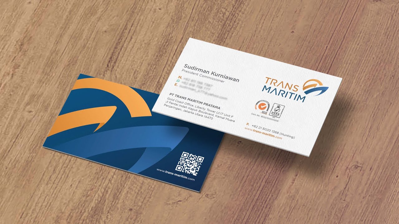
Trans Maritim Pratama
For Trans Maritim Pratama, a leading tug and barge shipping company, the goal was to create a visual identity that embodied their role as a trusted maritime partner. The new logo we designed is a dynamic and modern mark, where a stylized wave meets the strong prow of a ship, symbolizing their mastery over the seas. A professional blue and confident gold color palette reinforces their commitment to excellence. This new identity is a powerful symbol of their ability to navigate the complexities of marine transportation with confidence and reliability.
Trust Line Marine
The brand identity for Trust Line Marine was born from a single, powerful word: Trust. The logo we designed is the visual embodiment of that promise, a clean and modern mark where a fluid, wave-like curves conveys a sense of seamless and reliable voyages. The fresh blue and green color palette suggests a commitment to both professionalism and sustainability. Applied to their corporate identity and team uniforms, the final brand is a clear and confident symbol of a shipping partner that clients can depend on.
Trans Pacific Jaya
The brand identity for Trans Pacific Jaya needed to reflect the power and scale suggested by their name. The new logo we designed is a bold and dynamic 'TPJ' monogram, embraced by two powerful swooshes that represent ocean currents and a vast, trans-pacific reach. Rendered in a strong, confident blue, the mark is designed to be instantly recognizable, whether flying on a flag or applied to the hull of a vessel. The final identity is a powerful and assertive brand, perfectly suited for a major player in the global shipping industry.
Rimba Segara Lines
The mission for Rimba Segara Lines (RSL) was to create a brand identity that felt modern, dynamic, and environmentally conscious. Inspired by their tagline, "the ocean of opportunities", the new logo we designed is a fluid, abstract mark of two intertwined waves. The blue and green gradient symbolizes the synergy between the sea and a commitment to sustainability. This powerful supergraphic forms the core of their visual system, applied elegantly across all touchpoints from business cards to the impressive livery on their vessels, creating a fresh and optimistic brand for a forward-thinking player in the maritime industry.
KGV2
For Karawang Green Village 2, a Citanusa development, the brand identity needed to be a pure reflection of its name and its promise of "ideal green living". The logo we designed is an elegant and organic mark, a stylized sprout surrounded by floating leaves or butterflies, evoking a sense of nature, tranquility, and community. A fresh, vibrant green color palette reinforces this theme. The final visual identity is a clean, minimalist, and aspirational brand that perfectly communicates the vision of a modern, sustainable residential haven.
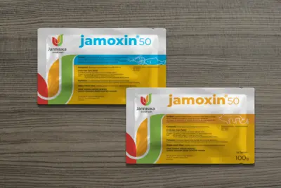
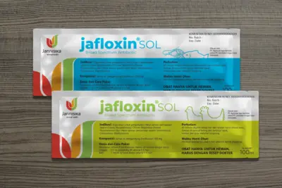
Jannisika
The brand identity for Jannisika, an animal pharmaceutical manufacturer, needed to convey a sense of health, vitality, and trust. The logo we designed is a modern and dynamic mark, a stylized 'J' formed by three energetic, leaf-like shapes in a vibrant red, orange, and green color palette. This symbol of natural wellness became the core of their visual identity, applied across their corporate stationery. The final brand feels professional yet caring, successfully positioning Jannisika as a modern and reliable partner in animal health.
Your logo and visual identity are your most enduring asset. We specialize in creating timeless, strategic systems that lay the foundation for future growth and recognition. A Strong Brand is Built to Last. Let's Build Yours.