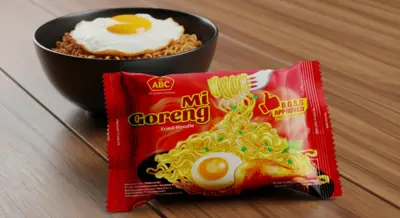
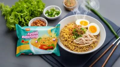
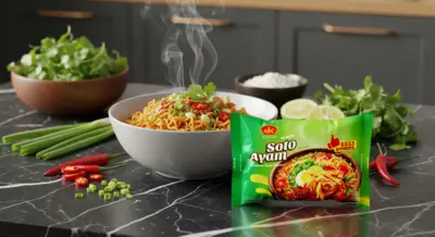
Mi ABC (ABC President Indonesia)
In the fast-paced, highly competitive world of instant noodles, packaging is the most critical battlefield. For the iconic Mi ABC brand, the mission was to create a new design series that would leap off the shelf. Our role spanned the full creative process, from initial concept to the final artwork for three core flavors: Soto Ayam, Mi Goreng, and Ayam Bawang. The design solution focused on maximizing appetite appeal, using vibrant colors and dynamic food imagery to create a mouth-watering first impression, all while integrating the confident 'B.O.S.S Approved' seal to build brand trust.
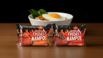
Mi ABC (ABC President Indonesia)
The instant noodle aisle is a battlefield of color. To launch a product line defined by intense spiciness, Mi ABC needed to break the visual code. The "Selera Pedas Nampol" series required a packaging design that was as bold and fiery as the taste itself. A dark, black canvas punctuated by vibrant flames and edgy typography became the foundation of the new identity, instantly signaling a modern and intensely spicy experience. The final artwork for the "Rasa Ayam Pedas" and "Rasa Sapi Pedas" flavors creates a powerful brand block on the shelf, daring consumers to embrace a new level of heat from a trusted brand.
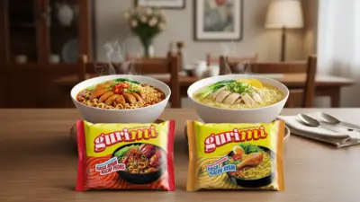
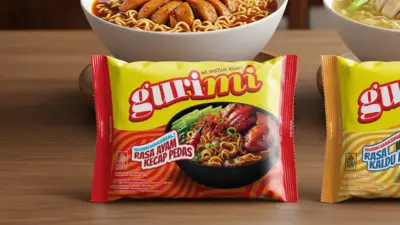
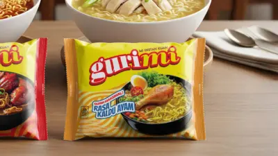
Gurimi (ABC President Indonesia)
Gurimi's extruded noodle product offered a modern, playful alternative in the traditional noodle category, demanding a packaging identity to match. The mission was to create a look that would instantly connect with a younger, more dynamic generation of snack lovers. Our visual strategy was built on a foundation of vibrant colors, energetic graphics, and charming characters, designed to stand out on the shelf and convey a sense of fun and excitement. The result is a cohesive packaging system that successfully launched a new product experience for ABC President Indonesia, establishing Gurimi as a go-to modern snack.
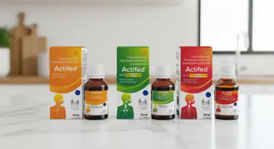
Actifed
For a globally recognized pharmaceutical brand like Actifed from GSK, a packaging redesign is a delicate balance. The mission was to rejuvenate the brand's visual identity to be more modern and intuitive, without sacrificing the immense trust it has built over decades. Our solution began with a subtle rejuvenation of the Actifed logo, followed by a complete packaging system redesign. The new design is built on a foundation of clarity, using a strong color-coding system, orange for allergy, green for expectorant, and red for cough suppressant, and intuitive iconography to help consumers quickly and safely choose the right remedy.
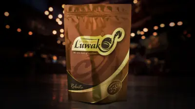
Premium Luwak
Kopi Luwak is a legendary Indonesian delicacy, demanding a brand identity that reflects its exclusivity and premium nature. For Otten Coffee's "Premium Luwak", the mission was to create a logo and packaging that felt both authentic and luxurious. The heart of the new identity is the logo itself, a clever and elegant fusion of a civet (Luwak) illustration seamlessly integrated into the brand's typography. This unique mark, paired with a rich metallic bronze and gold color palette, creates a sophisticated statement of quality, ensuring the visual experience is as excellent as the taste.
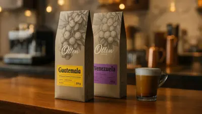
Otten Coffee
For a specialty coffee purveyor like Otten Coffee, each single-origin bean tells a unique story. The packaging system needed a design that could honor this diversity while maintaining a strong, cohesive brand identity. Our solution blends the artisanal with the modern. A beautiful, hand-drawn illustration of coffee cherries, consistent across all bags, evokes the natural origin of the product. This is paired with a clean, modular label system that uses distinct colors to easily identify each coffee's origin, from Guatemala to Venezuela. The final design, printed on natural kraft paper, creates a packaging experience that is as authentic and carefully crafted as the coffee inside.
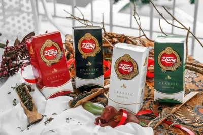
2 Tang Classic
With a legacy stretching back to 1942, the 2Tang Classic Series required a packaging design that could speak to its timeless quality. The mission was to create a look that felt both premium and deeply authentic, honoring a brand that has been a staple for generations. Our design solution is built on a foundation of classic elegance, using a clear, color-coded system to distinguish each tea variant, from Jasmine to Green Tea, while the prominent use of gold foil on the heritage logo adds a crucial touch of luxury. The result is a packaging system that is clean, confident, and unapologetically classic, reinforcing 2Tang's enduring promise of "Finest in Quality".
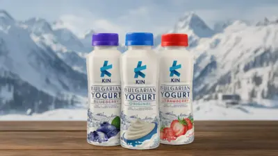
Kin Bulgarian Yogurt
Introducing a yogurt rooted in authentic Bulgarian tradition to a modern market required a packaging design that could tell a story of purity and freshness. This was the mission for the Kin brand. The design solution is built on clean, crisp minimalism, using the pristine white bottle as a canvas for a modern logo and beautiful, hand-drawn illustrations of pastoral scenes. This blend of modern branding and artisanal illustration creates a unique and premium feel, while a clear color-coding system for each flavor, from Original to Strawberry, ensures the packaging is as intuitive as it is appealing.
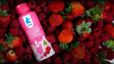
Kin Bulgarian Yogurt (Slim Berries)
To capture the growing market for functional, health-conscious products, the Kin brand needed to expand. The "Slim Berries" variant required a packaging design that could instantly communicate its "Low Fat" and "Fiber" benefits. Our solution uses a vibrant, energetic pink to create a powerful visual statement on the shelf, replacing the original line's pastoral illustrations with a more dynamic splash graphic to target a wellness-focused audience. The result is a successful line extension that broadens the Kin brand's reach into the functional food space.
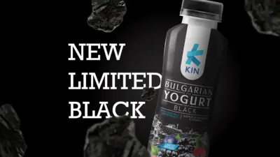
Kin Bulgarian Yogurt (Limited Edition Black)
To generate excitement, Kin launched a daring "Limited Edition Black" yogurt, requiring packaging as sophisticated and unexpected as the product itself. Our design solution dramatically inverted the brand's established visual identity, transforming the familiar bottle into a sleek, matte black canvas with the logo and pastoral illustrations rendered in a crisp white. This elegant reversal creates a powerful sense of intrigue and premium exclusivity, positioning the vegetable carbon black yogurt as a must-try innovation for modern consumers.
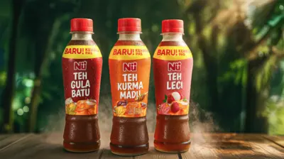
Nu Black Tea Series
When a leading ready-to-drink tea brand introduces new flavors, the design must feel both excitingly new and comfortingly familiar. This was the mission for the Nu Tea series. Our packaging design solution for variants like 'Teh Gula Batu', 'Teh Kurma Madu', and 'Teh Leci' is built on a foundation of vibrant, appealing visuals. The design prominently features high-quality illustrations of the core ingredients against a rich tea-colored backdrop, instantly communicating a burst of delicious flavor and refreshment in its new, convenient bottle.
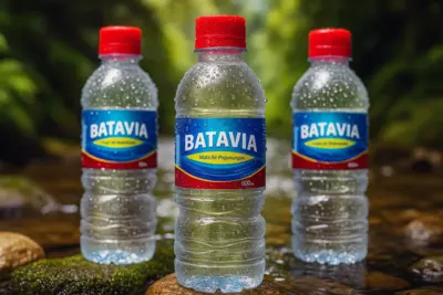
Batavia
For Batavia's "Mata Air Pegunungan" (Mountain Spring Water), the mission was to create a label design that conveys a powerful sense of freshness and purity. The new label is built on a vibrant and dynamic design, using a bold blue and a striking red and gold swoosh to capture attention. The typography is clean and modern, while the overall design feels energetic and refreshing. The result is a label that leaps off the shelf, effectively communicating the crisp, clean taste of mountain spring water and successfully revitalizing the brand's presence in a competitive market.
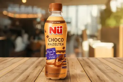
Nu Choco Hazeltea
Launching an innovative flavor like 'Choco Hazeltea' required packaging that could instantly communicate its unique, indulgent taste to a young, trend-conscious audience. The design is built around a warm, creamy color palette and a dynamic splash of chocolate, immediately creating a sense of craving. With a playful identity and modern calls to action like #FIXENAK, the packaging successfully positions Nu Choco Hazeltea not just as a drink, but as a must-try modern treat.
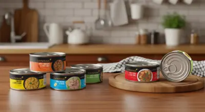
Carvinna
The challenge for Carvinna was to elevate the perception of canned meals from a simple pantry staple to a desirable, convenient dining solution. Our packaging design was conceived to tell this story of quality and modern flavor. The design is built on a sophisticated black label that provides a premium canvas for vibrant, top-down food photography, maximizing appetite appeal. A clean, color-coded system clearly differentiates each variant, from Spicy Curry Chicken to Tuna Chunks in Brine, creating a product line that looks delicious, modern, and trustworthy on the supermarket shelf.
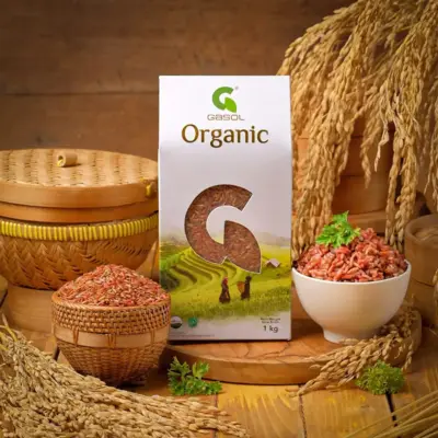
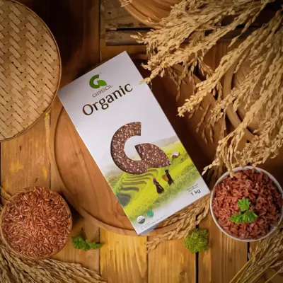
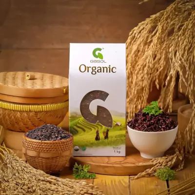
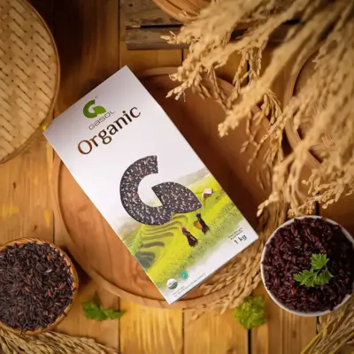
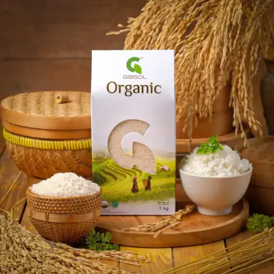
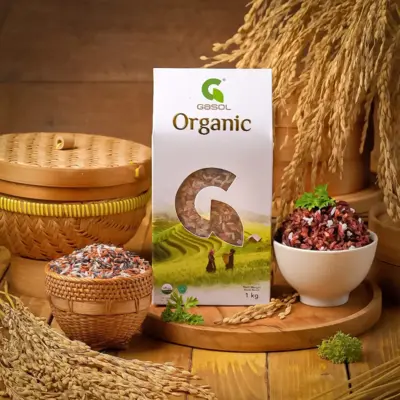
Gasol Organic
The challenge for Gasol Organic rice was to create packaging that immediately communicates its core values: organic, natural, and authentic. The design solution is centered on a clean, white package that acts as a canvas for a unique diecut window shaped like the letter 'G'. This window not only reveals the premium organic rice inside but also frames a beautiful, serene image of farmers in terraced paddy fields. This "window to the harvest" concept creates a powerful story of origin and transparency. The final design is a cohesive system that feels pure, trustworthy, and deeply connected to the earth.
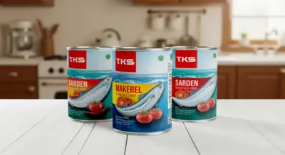
TKS Sardines & Mackarel
Refreshing a classic pantry staple like canned sardines and mackerel requires a design that feels both trustworthy and appealing. For TKS, the mission was to modernize their look while honoring their traditional appeal. Our design solution centers on clean, bright illustrations of the fish and fresh ingredients, like tomatoes and chili, creating a sense of quality and deliciousness. The visual identity uses a vibrant color palette and clear typography to stand out on the shelf, successfully revitalizing a classic brand for the modern consumer.
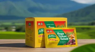
AMH - Daya Tahan Tubuh
The mission for AMH's "Daya Tahan Tubuh" was to package a traditional herbal remedy for the modern consumer. The design needed to communicate both the natural power of its ingredients, like Red Ginger and Habbatussauda, and its efficacy as a daily immune booster. A bright, optimistic yellow serves as the base, while a dynamic, sun-ray graphic frames the herbal ingredients, creating a sense of natural energy. The final packaging feels vibrant, trustworthy, and effective, successfully bridging the gap between heritage wellness and modern convenience.
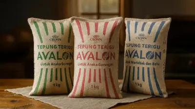
Crown Avalon
For a foundational ingredient like wheat flour, packaging must communicate reliability and purpose at a single glance. The design system for Crown Avalon flour was conceived to do exactly that for its professional and home baking audience. The identity is built around a bold, classic striped pattern that creates a powerful and easily recognizable brand block. A clear color-coding system, green for bread and noodles, red for fritters, and blue for cakes, makes product identification effortless in a busy kitchen or warehouse, ensuring the visual identity is as dependable as the flour inside.
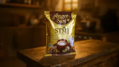
Anget Sari STMJ
STMJ is a beloved traditional Indonesian remedy. For Forisa's "Anget Sari+", the challenge was to elevate this classic into a premium, convenient instant drink. The packaging design was conceived to evoke a powerful sense of warmth, comfort, and quality. A creamy, inviting color palette and a beautifully styled photograph create an irresistible appetite appeal. The design strategically highlights the premium quality of each ingredient, from New Zealand Milk to Jahe Emprit, building trust and successfully positioning Anget Sari+ STMJ as the definitive, high-quality version of a timeless classic.
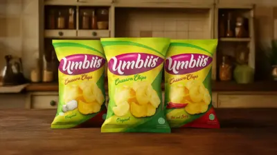
Umbiis Cassava Chips
The mission for Umbiis was to take a beloved traditional snack, cassava chips, and give it a fresh, modern, and irresistible identity. The packaging design we created is built on a foundation of vibrant, energetic colors like lime green and yellow to create an immediate sense of fun and freshness. A playful, custom logotype and high-quality photography showcasing the chips' perfect crunch work together to maximize appetite appeal, successfully rebranding a classic staple for the modern snack lover.
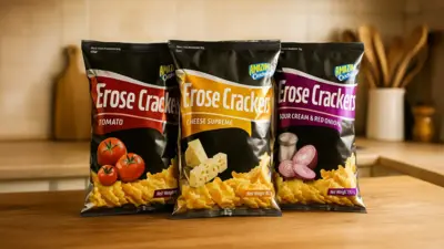
Erose Crackers
Erose Crackers needed a packaging identity as bold and modern as its flavors. Our design solution for this new snack line was built on a sophisticated, matte black canvas, a choice that immediately sets it apart in the colorful snack aisle. This dark background provides the perfect stage for a dynamic, color-coded swoosh and vibrant photography of the core ingredients for each flavor, from 'Cheese Supreme' to 'Sour Cream & Red Onion'. The final design is edgy, premium, and packed with appetite appeal, perfectly targeting a modern consumer looking for a more exciting snacking experience.
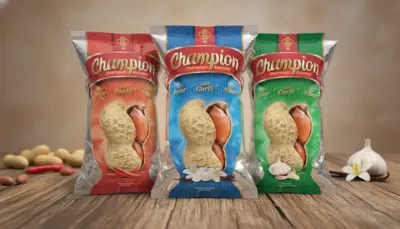
Champion
With a name like 'Champion' and a tagline like 'Juaranya Kacang' (The Champion of Peanuts), the packaging had to project an immediate sense of premium quality. Our design solution for this classic peanut snack is built on a rich, regal color palette with gold accents. The centerpiece is a clever, peanut-shaped die-cut window that showcases the high-quality product inside, while a clear color-coding system differentiates the unique flavors, from 'Hot & Spicy' to 'Vanilla'. The final design feels confident and premium, perfectly reflecting the brand's promise to be the true champion of peanuts.
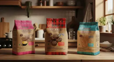
Manon Brownies
The challenge for Manon Chocolatier & Patissier was to translate the quality of their artisanal baked goods into a packaging system that felt equally premium and hand-crafted. Our design solution for their Brownies and Blondies line is built on a rustic, kraft paper texture that evokes a warm, bakery feel. Each variant, from 'Cinnamon Coffee' to 'Hokkaido Milk Creme', is distinguished by a unique color palette, while delicious, soft-focus photography maximizes the sense of indulgence. The final design is a perfect blend of rustic elegance and modern appeal.
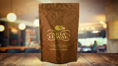
Aria Luwak
For a luxury product as exclusive as Kopi Luwak, the packaging must communicate its premium stature in a single glance. The design for Aria Luwak is built on a foundation of pure elegance. The entire pouch is enveloped in a sophisticated, repeating geometric pattern, creating a tactile and visually rich texture. A graceful, gold-foil logo sits at the center, reinforcing the brand's commitment to 'an AUTHENTIC TASTE of EXCELLENT COFFEE'. The final result is a packaging design that is understated yet undeniably luxurious, perfectly suited for one of the world's most sought-after coffees.
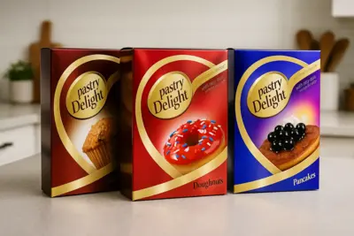
Pastry Delight
The mission for Pastry Delight was to create packaging that inspires the joy of home baking. The design needed to feel simple, elegant, and promise a delicious result. The visual identity is built around a bold, golden swoosh that elegantly frames a mouth-watering photograph of the final creation, from doughnuts to pancakes. A clean, color-coded system creates a strong and vibrant brand block on the shelf, while the overall modern aesthetic makes home baking feel accessible and delightful, creating a clear invitation to enjoy a sweet moment at home.
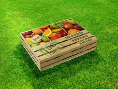
Total Buah Segar
How do you elevate a fruit hamper into a truly special gift? For Total Buah Segar, the answer was a packaging concept that is as fresh and clever as the contents inside. We designed a premium gift box that ingeniously mimics the look of a rustic, wooden fruit crate. Large, open 'slats' in the design reveal a vibrant photograph of the fresh fruit, immediately communicating the "100% FRESH" promise. The final result is a charming and memorable gift packaging that transforms a simple, healthy present into a delightful experience.
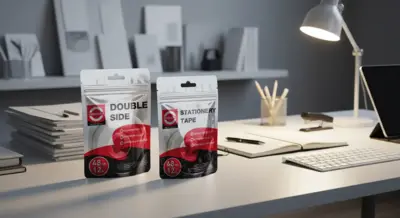
Daimaru
Even an everyday office staple like tape deserves packaging that reflects its quality. The mission for Daimaru Tape was to create a modern, professional, and trustworthy look that lived up to their "FOR THE QUALITY" promise. Our design solution for their 'Double Side' and 'Stationery Tape' is built on a clean, technical aesthetic, using a dynamic red and black graphic to create a strong visual identity. Clear iconography highlights key benefits like 'Premium Quality' and 'Strong & Durable', instantly communicating the product's reliability to the consumer.
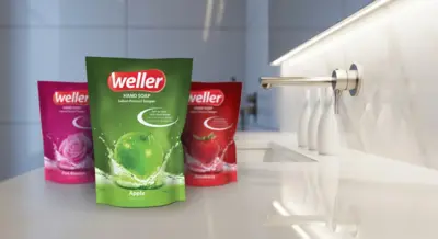
Weller
Handsoap Packaging Design

HeliaTech Sunscreen
The challenge for HeliaTech Sunscreen was to create packaging that conveys both high-performance UV defense and a light, comfortable skin feel. The design solution is built on a clean, white canvas accented with a vibrant, metallic orange, evoking the energy of the sun. A dynamic, modern logo and clear, structured typography communicate the product's scientific credibility, including its SPF 45+ protection and paraben-free formula. The final packaging feels fresh, technical, and trustworthy, perfectly suited for an active, outdoor lifestyle.
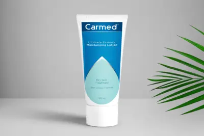
Carmed Moisturizing Lotion
For Carmed's moisturizing lotion, the packaging needed to communicate a promise of effective, therapeutic relief for dry skin. The visual identity we designed is built on a foundation of clinical minimalism. A calming blue gradient and a central, droplet-shaped graphic create a powerful symbol of deep, scientific hydration. The clean typography and uncluttered layout reinforce the product's "Non-Greasy Formula" and its role as a serious "Dry Skin Treatment". The final design feels trustworthy and effective, positioning Carmed as a go-to dermatological solution.
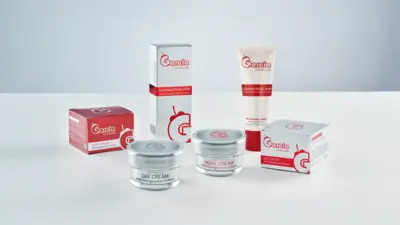
Garcia Skincare
Garcia Skincare's identity is rooted in the power of a natural superfruit: the mangosteen. The packaging system we designed needed to reflect this unique blend of nature and science. The aesthetic is clean, clinical, and minimalist, using a crisp white, red, and silver palette to build a sense of trust and efficacy. A modern, stylized logo subtly hints at the natural origins of the ingredients. The final design for their full range, from Day Cream to Cleansing Facial Wash, is a cohesive and professional system that feels both effective and pure.
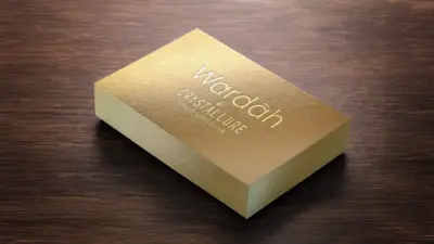
Wardah Crystallure
The packaging for Wardah's premium 'Crystallure' line needed to be more than a box, it had to be a statement of pure luxury. Our design solution for the Smooth Satin Lipstick is built on a foundation of sophisticated minimalism. A rich, textured gold material was chosen for the entire package, creating an immediate sense of prestige. The brand and product names are applied with a crisp, elegant gold foil stamp, allowing the quality of the materials and finishes to speak for themselves. The final result is a packaging experience that feels exclusive, indulgent, and undeniably premium.
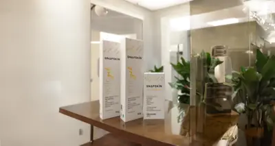
Amway Snapskin
The mission for Amway's 'Snapskin' was to create an acne care line that felt modern, gentle, and effective, moving away from harsh clinical aesthetics. Our design solution for the 'acne gel' and 'acne serum' is built on a foundation of clean minimalism with a touch of playful energy. A crisp white canvas is accented with a modern, abstract pattern, while a friendly script for the product names makes the line feel approachable. The 'Formulated in Korea' tagline is prominently featured, leveraging the credibility of K-beauty to build trust and appeal to a young, savvy audience.
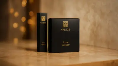
Valege
Valege's French heritage and positioning as a luxury cosmetics brand demanded packaging that whispered elegance rather than shouted. Our design solution for their lipstick and loose powder is an exercise in sophisticated minimalism. A deep, matte black serves as the canvas, providing a dramatic contrast for the crisp, gold foil typography and the classic, heraldic logo. A subtle, intricate pattern is veiled in a gloss finish, revealing itself only upon closer inspection. The final result is a packaging experience that feels timeless, exclusive, and utterly luxurious.
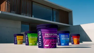
Sigma Lumina
The mission for the Sigma Lumina series from Sigma Utama, was to create a cohesive and modern packaging system for their entire range of paint solutions. The visual identity is built around a bold, geometric arrow pattern, creating a powerful and dynamic brand block that unifies every product, from 'Perform' exterior paint to 'Water Proof' coatings. A vibrant, systematic color palette clearly distinguishes each product's function, while the overall design feels premium, technical, and confident, projecting the high-performance quality of the Sigma brand.
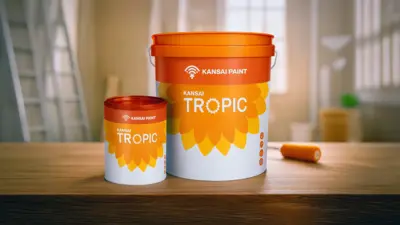
Kansai Tropic
For Kansai's 'Tropic' paint line, the packaging needed to evoke the warmth and vibrancy of a tropical climate. The design is centered on a beautiful, stylized sun or flower motif, whose layered petals create a sense of brightness and energy. A warm orange and yellow color palette reinforces this optimistic and friendly feel. The final design is clean, approachable, and perfectly aligned with its name, creating a product that promises to bring the light of the tropics into any home.
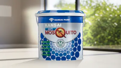
Kansai Anti Mosquito
The mission for Kansai's Anti-Mosquito paint was to clearly communicate a powerful, functional benefit while assuring customers of its safety. The packaging design we created is built on a foundation of trust and clarity. A prominent central icon instantly communicates the paint's anti-mosquito properties, while a 'Family Safe' seal provides immediate reassurance. The clean, clinical aesthetic with a modern circular pattern reinforces the innovative technology behind the product, creating a packaging design that is both informative and deeply trustworthy.
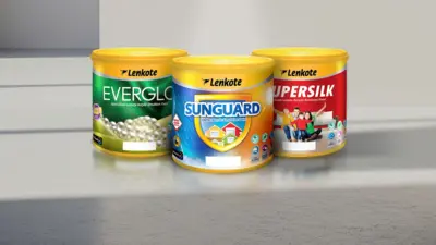
Lenkote (Avian Paints)
The mission for the Lenkote paint series was to create a packaging system that could house a diverse family of products under one unified, premium identity. Our design solution gives each sub-brand its own distinct personality while maintaining a cohesive look. The luxurious green and pearl imagery for 'Everglo' communicates a lustrous finish, the protective shield of 'Sunguard' instantly signals exterior durability, and the warm family photo for 'Supersilk' speaks to a beautiful, safe home. The result is a clear and appealing packaging system that makes it easy for consumers to find the perfect, high-quality finish for any need.
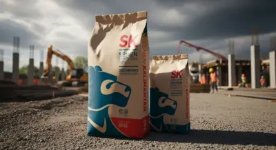
Semen Kalimantan
The mission for Semen Kalimantan was to create a new brand identity that would instantly communicate a message of regional pride and unwavering strength. Our engagement began with the creation of a powerful new logo: a stylized sun bear, an icon of Kalimantan's resilience and power. This new mark became the heart of the packaging design. The final design for their Portland and Composite cement sacks is bold, confident, and memorable, creating an iconic brand presence that stands strong in the competitive construction materials market.
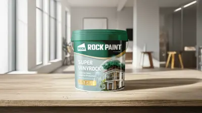
Rock Paint
To communicate the 'Superior Protection' of Rock Paint's Super Vinyrock, we moved beyond traditional paint packaging visuals. The design is centered on a powerful and futuristic metaphor: a home shielded by a glowing, hexagonal forcefield, instantly communicating a message of advanced technology and ultimate durability. A deep green color palette and clean, confident typography reinforce the premium quality of the acrylic paint. The final design positions Super Vinyrock not just as paint, but as a high-tech shield for your most valuable asset.
Your packaging is your most vital salesperson. Let's create a research-backed, beautifully crafted design that captures attention and persuades the purchase.